Understanding mobile
Mobile isn't easy, it requires you to prioritize content and do the legwork of understanding what's important to your users. People are aware of and less tolerant of product experiences which don't meet their expectations on mobile. It's easier when you take a mobile first approach rather than trying to shoehorn a desktop experience into a smaller screen. Desktop experiences which get ported into mobile face unique challenges. Companies are forced to either cram everything into a smaller screen, remove features and functionality or hide everying inside of a navigation drawer rather than taking a content first approach. With a little guidance, some examples and a proper set of responsive components anything is possible.
Now more than ever people are more comfortable using their phones to be productive. People reach for their smartphones and tablets when browsing mortgages, look for flights, purchase computers, find partners, navigate, listen to music, take photos and videos, send emails or chat with friends. You can even file your taxes on your phone. At this point mobile is largely ubiquitous.
Mobile spec for adequate tap areas
Interaction attention on mobile is about half of desktop but users appreciate the speed and convenience mobile provides. People appreciate when mobile products allow them to pop in and accomplish a task quickly.
Allowing users access to your product or service on a variety of devices is also an accessibility issue. There was an increasing number of unique visits to the Adobe Stock mobile website, with some dropoff as users moved down the funnel due to broken experiences, desktop centric designs and low usability.
Foundational
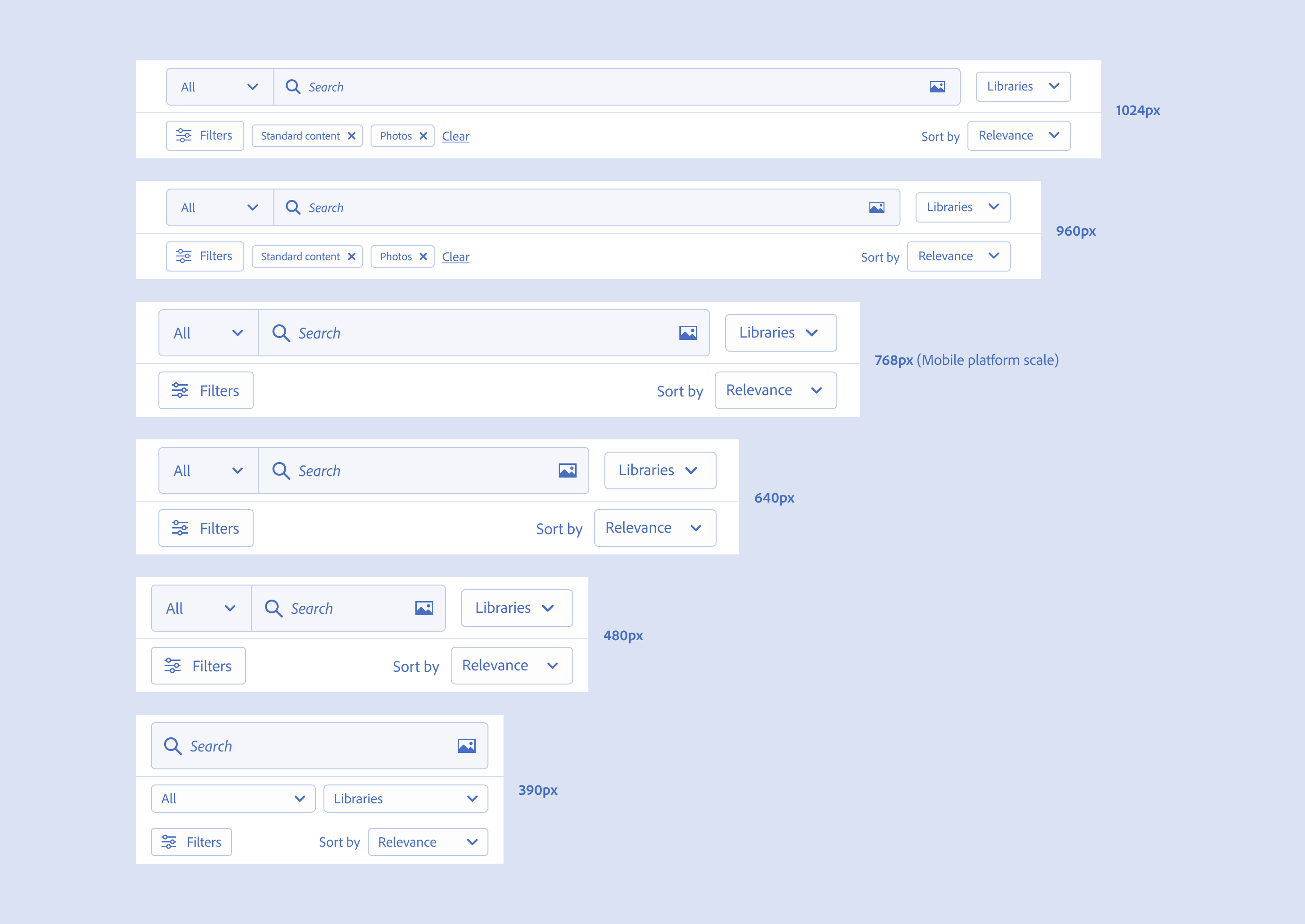
Other designers on the team needed references and examples of how to think about designing for mobile web. I explored practical breakpoint guidance and applied Spectrum's 12 column grid for underlying structure, then looked at other more useful column grids specifically for common mobile screen sizes.
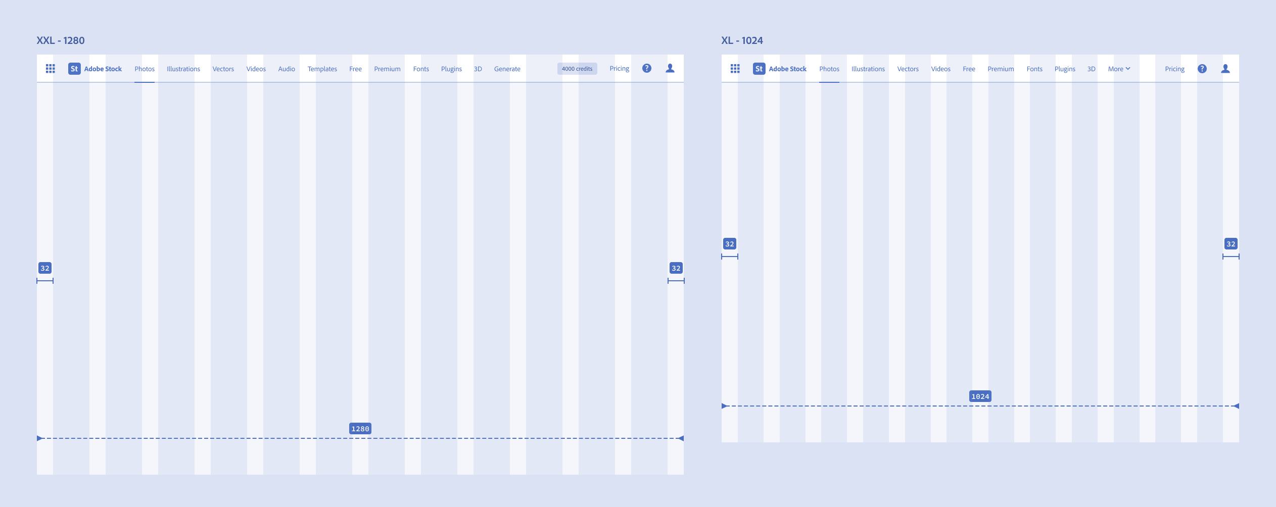
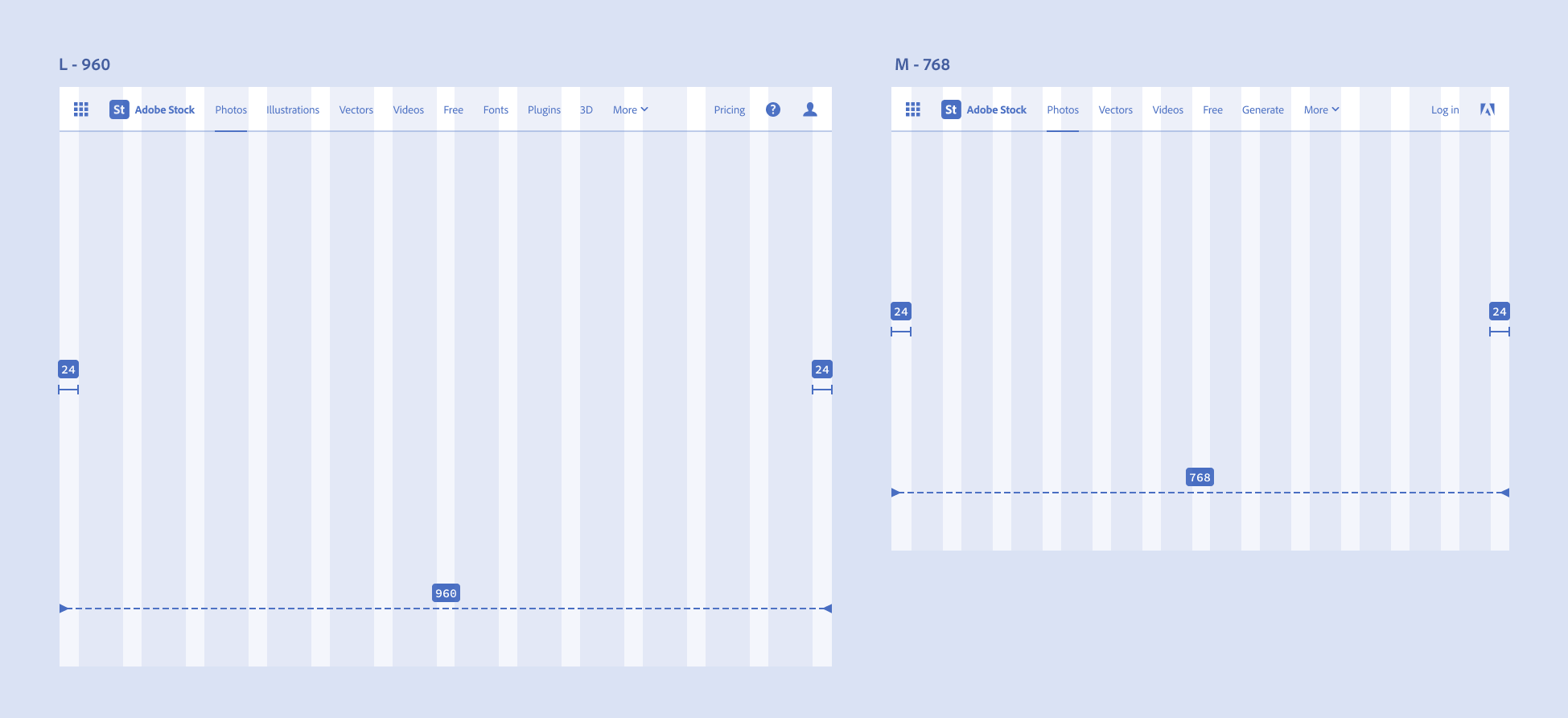
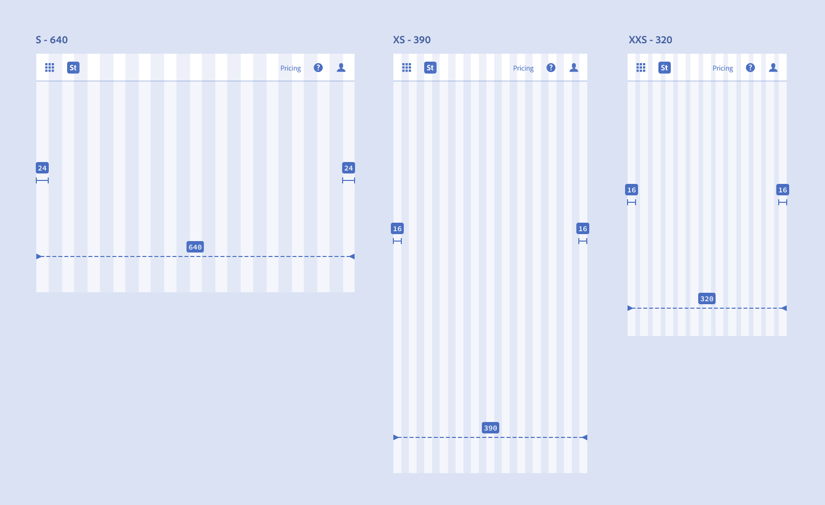
Margin and 12 column grid scale. XXL (1280), XL (1024), L (960), M (768), S (640), XS (390), XXS (320).
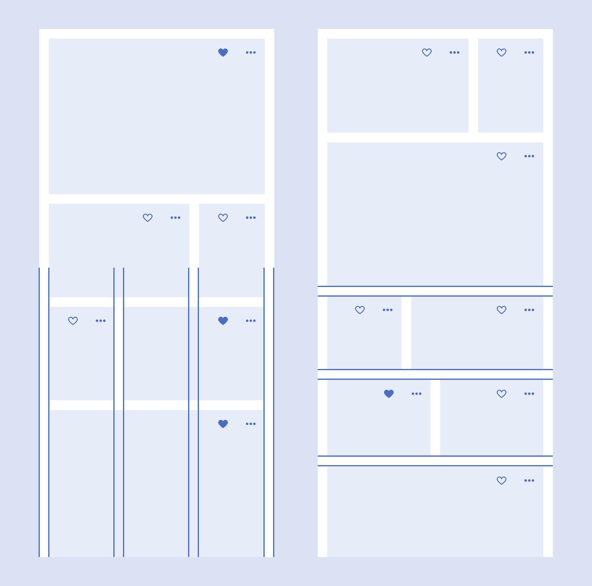
Explored a more usable 3 column and match heights grid for mobile screens (compared to 12 column)
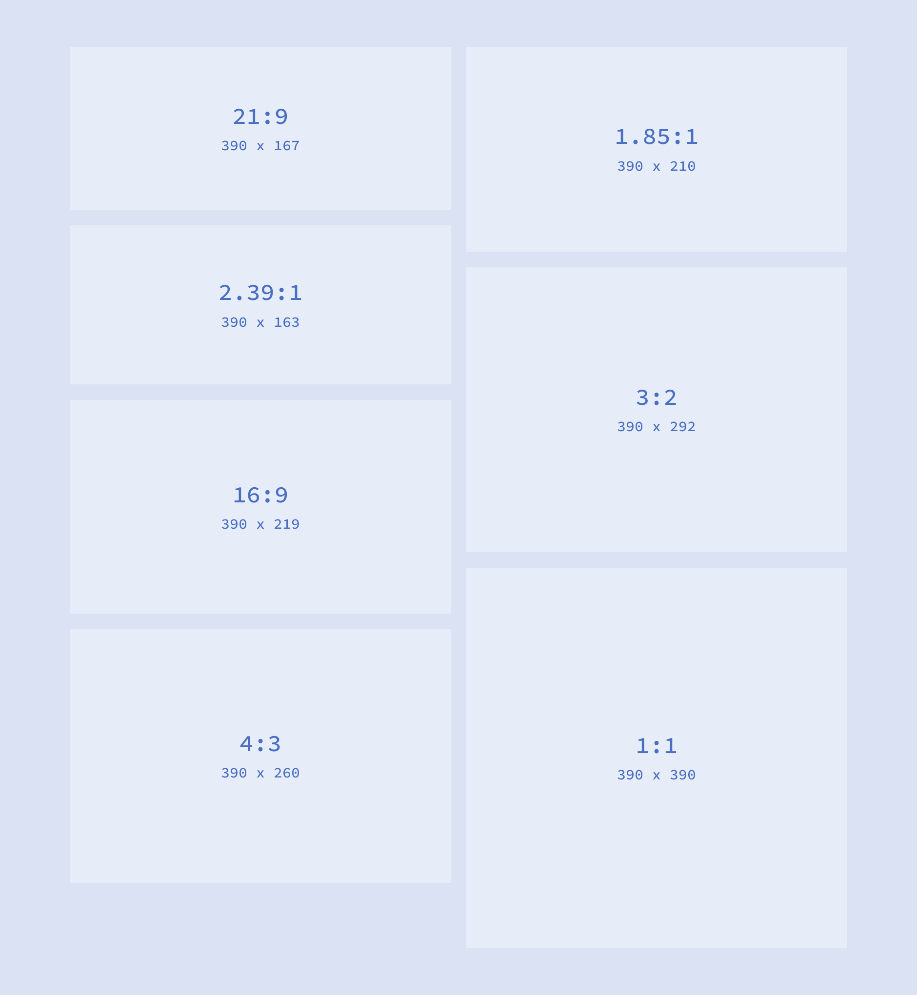
Common aspect ratios for image grids
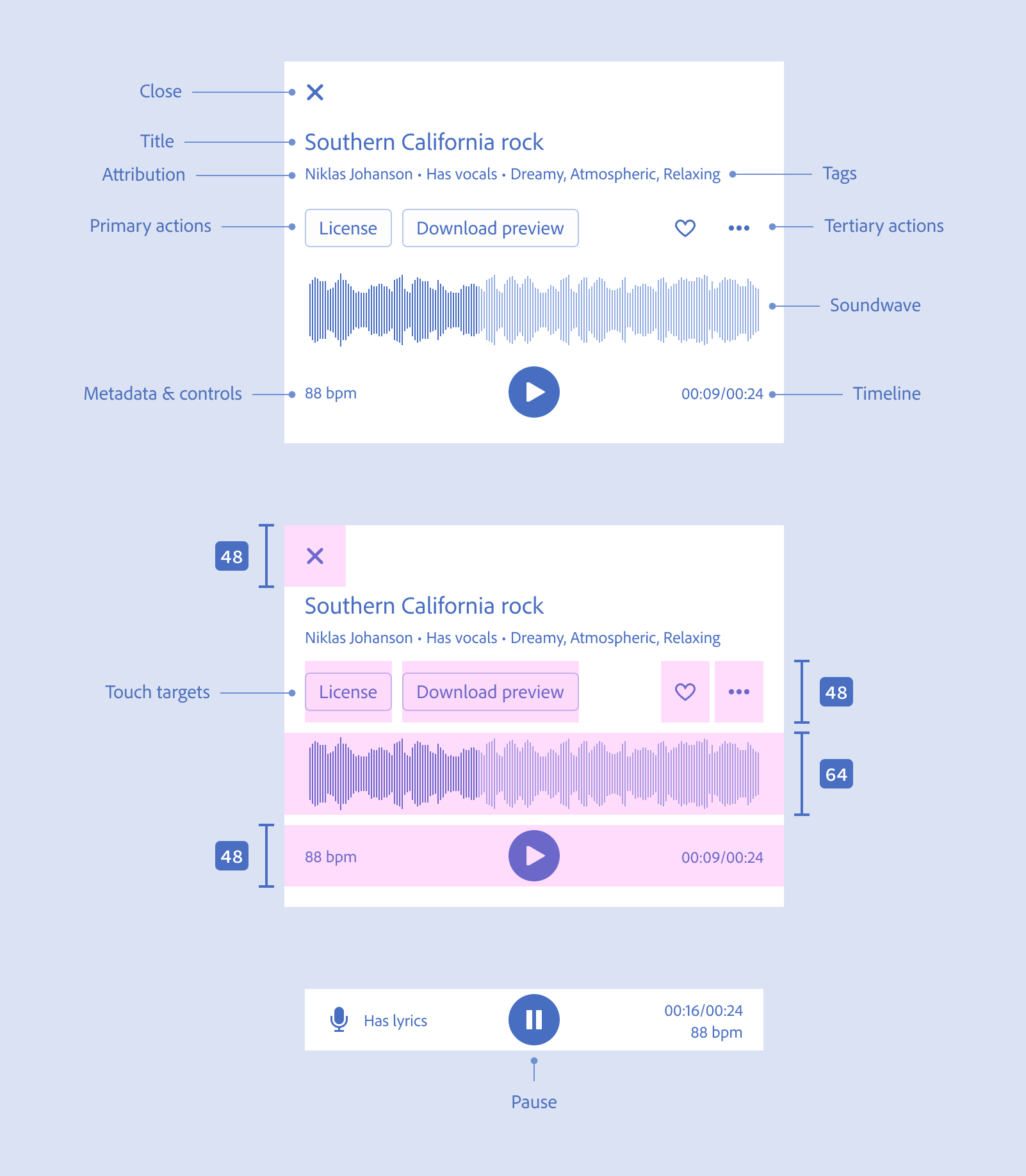
Adobe's design language Spectrum has a mid-fidelity spec style. Spectrum's mobile library is limited and doesn't include product specific components.
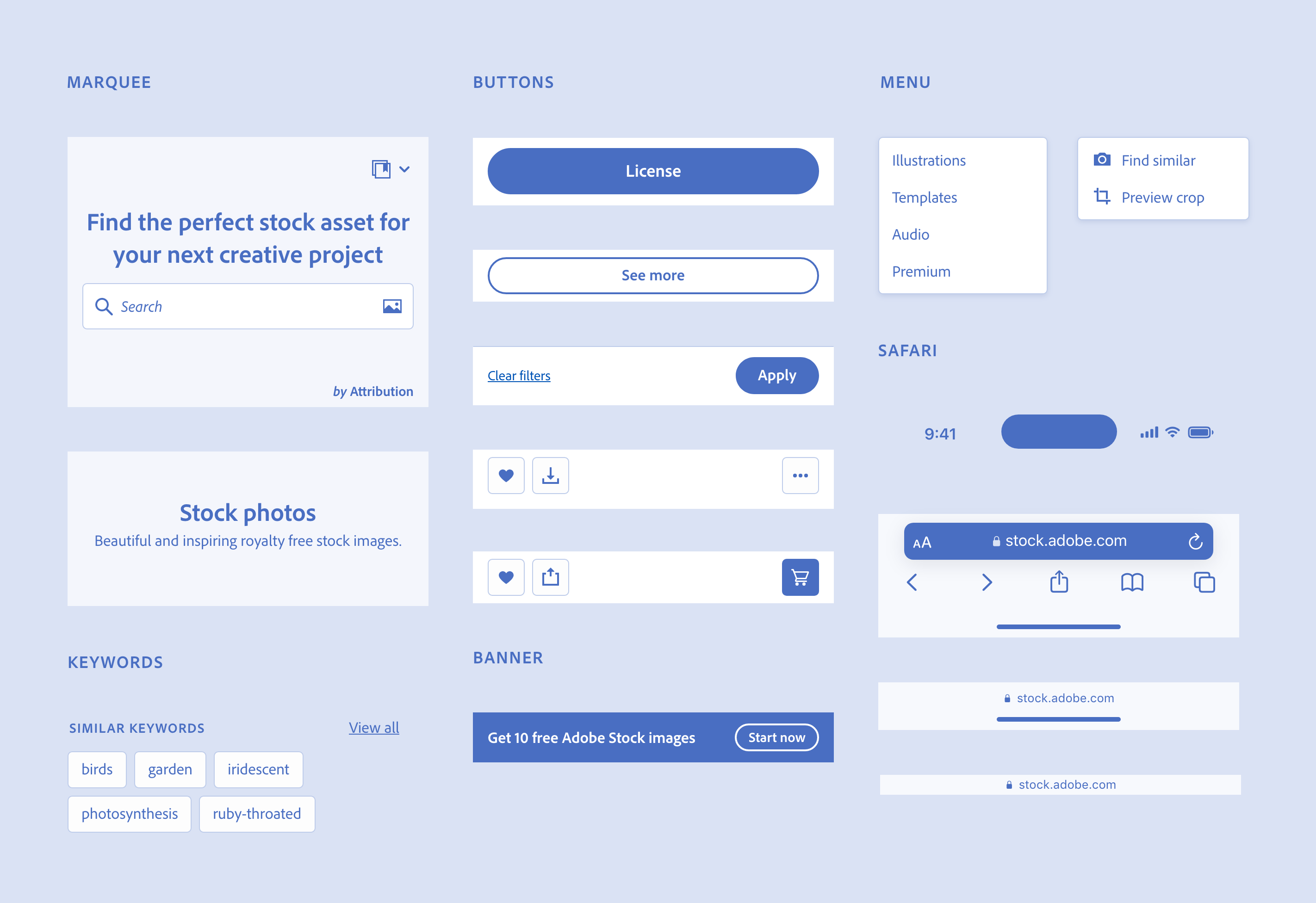
I created a set of mid-fidelity and design language agnostic reusable components based on the Adobe Stock desktop site and Spectrum's existing design language appropriately sized for mobile touch targets. The website had branched their repository and weren't getting the latest updates from Spectrum. Part audit, part method to empower the team and part exercise to spur further conversation about updating the mobile design language and creating a more responsive approach.
Components were made in Adobe XD and then redrawn again in Figma
Most of these components were created to help unlock the work I was doing and empower other designers on the team to feel more comfortable thinking about the feature work they were doing and how it would translate to mobile.
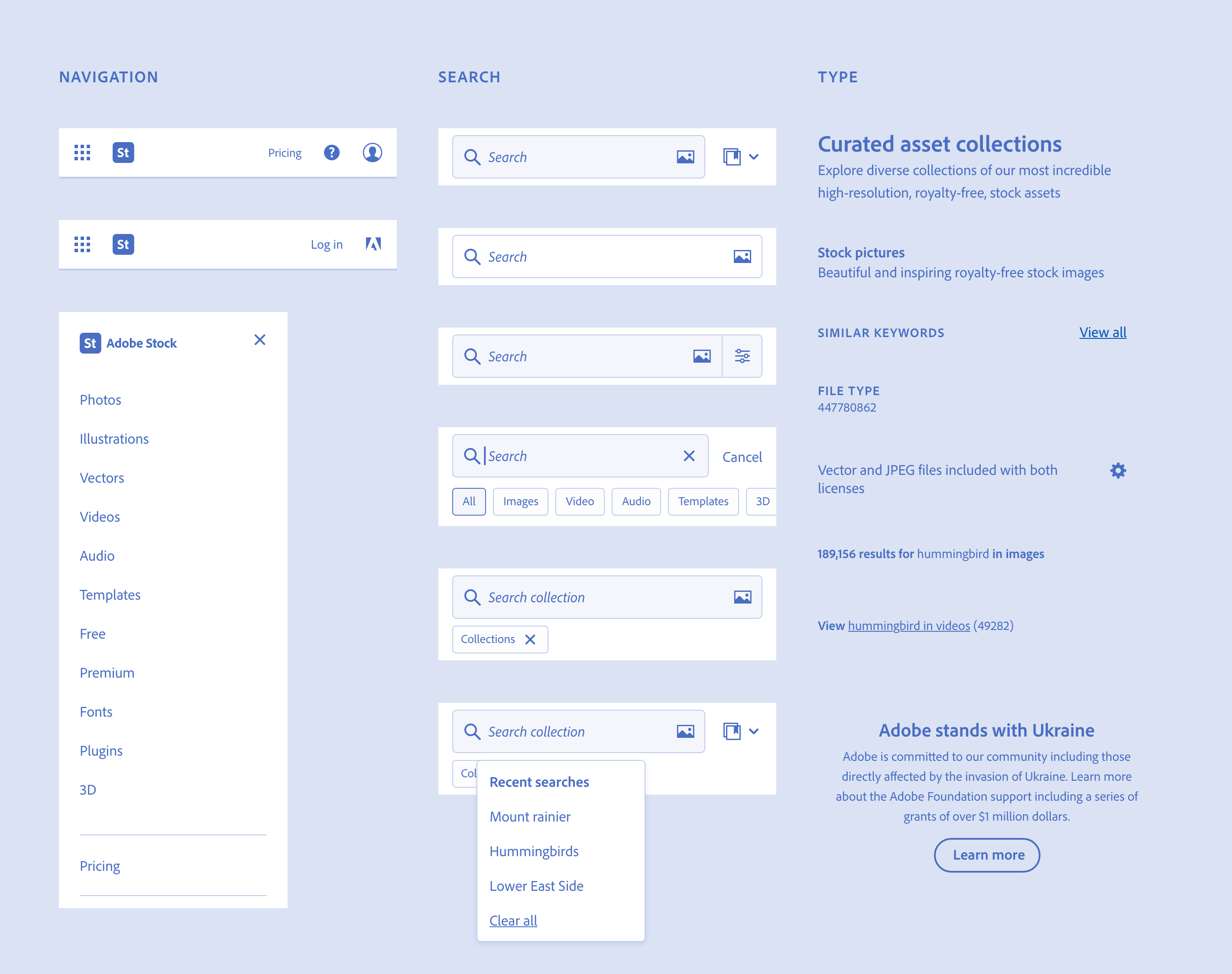
Search is primary to the user experience and a critical part of the system. Understanding which features people found useful and which capabilites could be moved, removed or deprioritized were vital to redesigning search and core experience. The asset type dropdown had been hidden on mobile so users had to go up around through the side navigation in order to search within an asset type. Early on I proposed a dedicated search mode that would simplify the user experience, removed the dropdown and also scale to desktop.
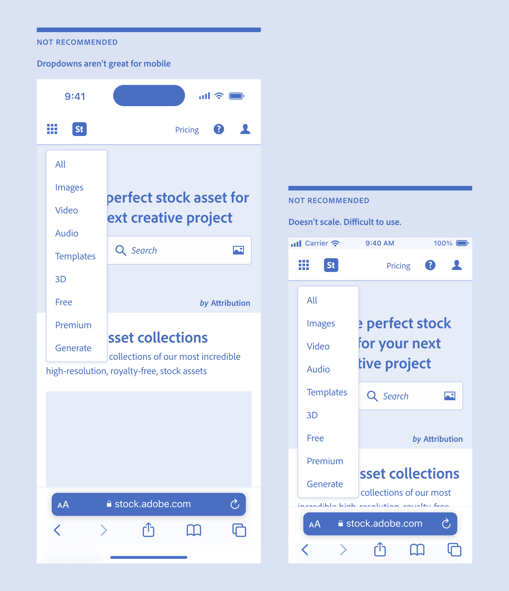
Fuck dropdowns
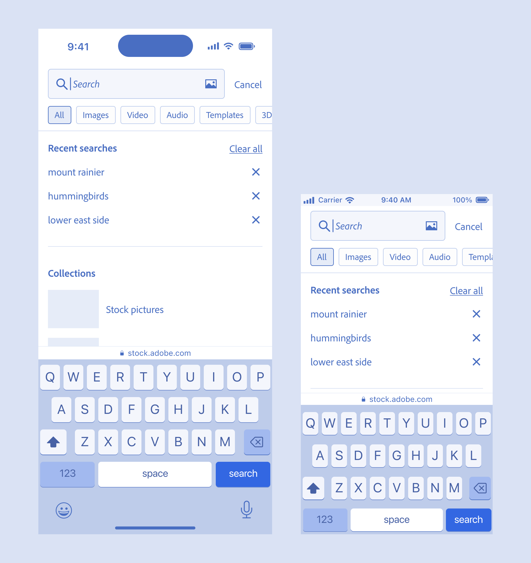
Search mode 390 and 320px. Allows asset type filtering.
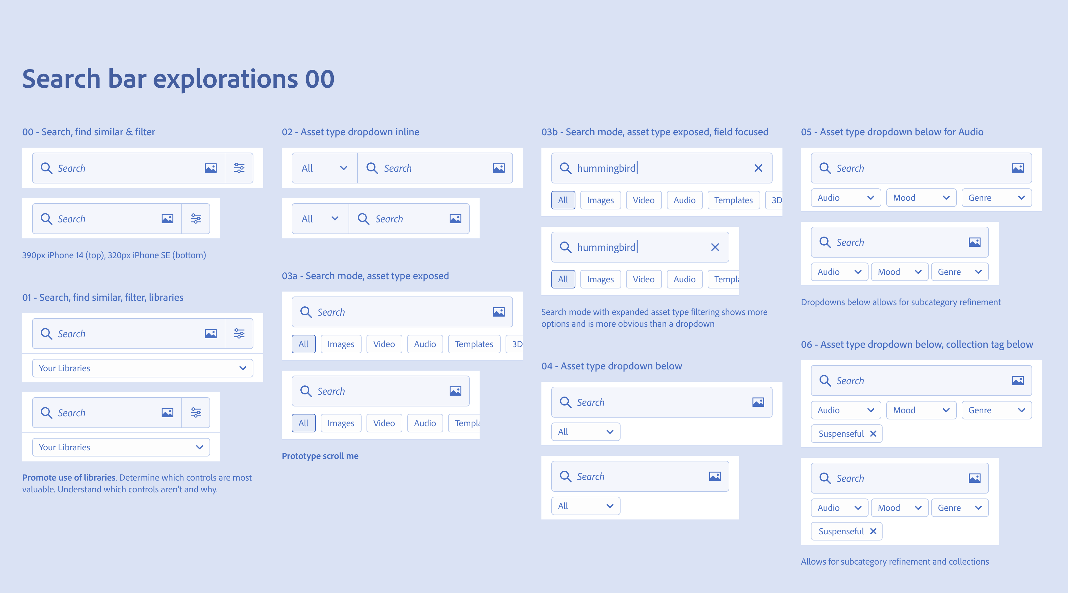
Search bar explorations were key to simplifying the user experience
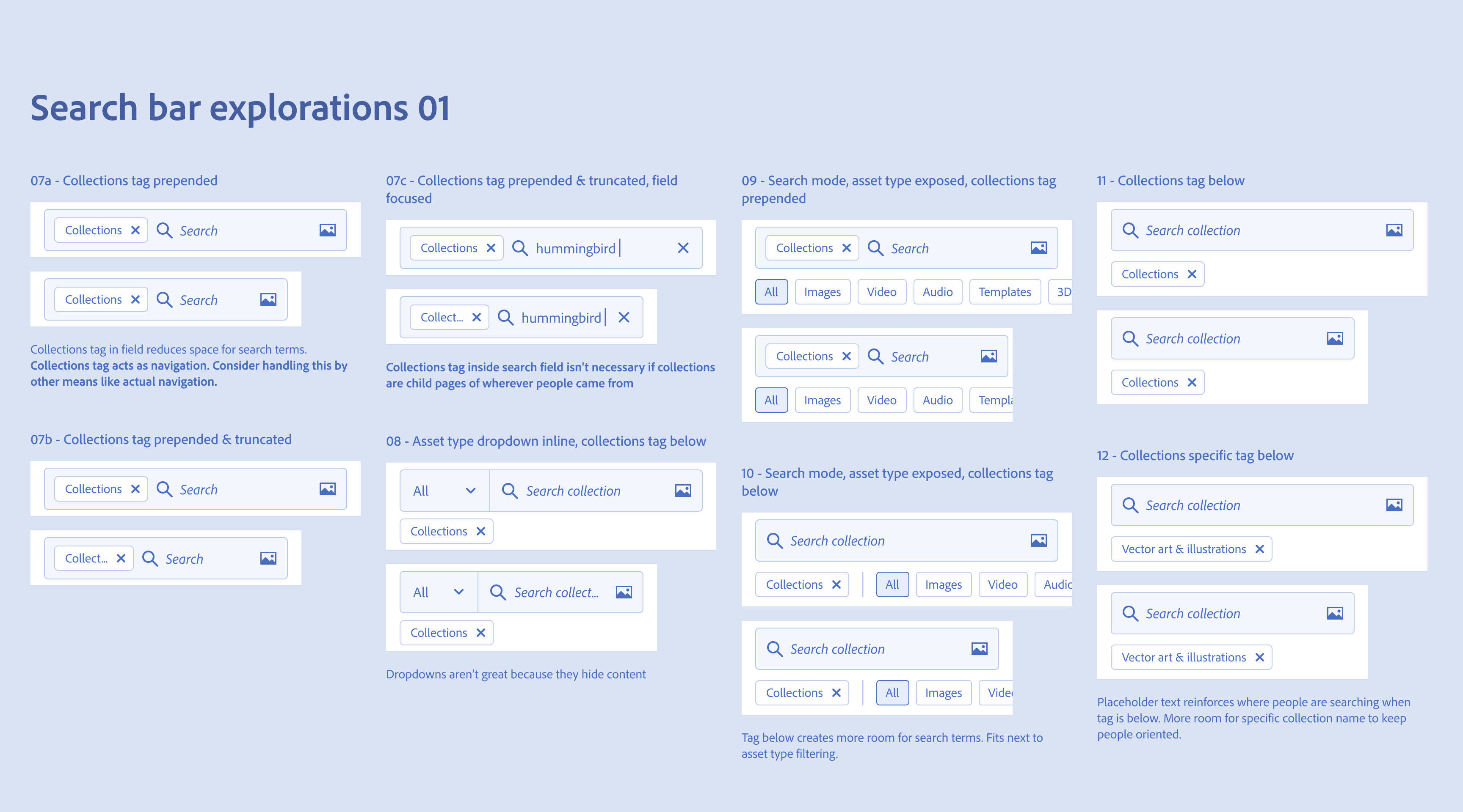
Explorations help illustrate the breadth of options and pros and cons of each
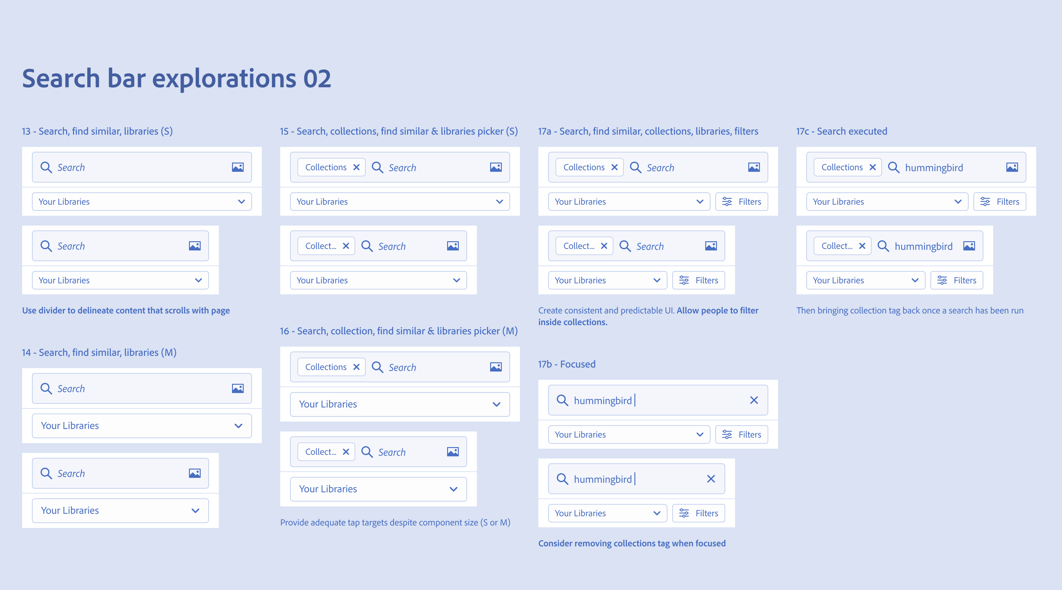
Recommended taking a user centered approach, promoting discovery of libraries and the prepended Collections tag
Mobile concepts like progressive disclosure and the importance of having a solid framework, reusable components and repeatable and consistent UI were part of the recommendations I introduced in this work. I provided concrete examples of how to think about designing for mobile across platform scales and viewport sizes from 1280 to 320px, Apple's smallest 4" iPhone SE. Without considering mobile you're more likekly to give in to the tendency to fill up the interface with unnecessary content at the expense of visual clarity.