12 minute read
Adobe is a leader in creative tooling across the design industry. The first version of Photoshop I used was Photoshop 7, so it was a pleasure to work on the Adobe Stock website and bring an adaptive and flexible approach to the multi browser world we live in. Previously the Adobe Stock website had not taken mobile navigation, content strategy and adequate touch targets into account. The product had removed features or deprioritized mobile altogether. Not only was this an accessibility issue, but to truly bring the ethos of 'Creativity for All' to life, embracing responsive web design principles was necessary.
Problem
The Adobe Stock marketplace didn't scale to smaller viewports and certain capabilities were missing from the mobile experience. The site was still using side navigation and there were multiple conflicts and inconsistent UI from larger to smaller browser widths. On smaller phones like the iPhone SE, Apple's 4" (320px) the site was largely unusable.
Spectrum, Adobe's cross platform design language provided limited guidance for mobile screens but did include basic references for mobile touch targets and defined two different platform scales, one for desktop and one for mobile. The Adobe Stock site had taken the existing desktop website and mostly ported it over to mobile, without considering best practises, accessibility or usability.
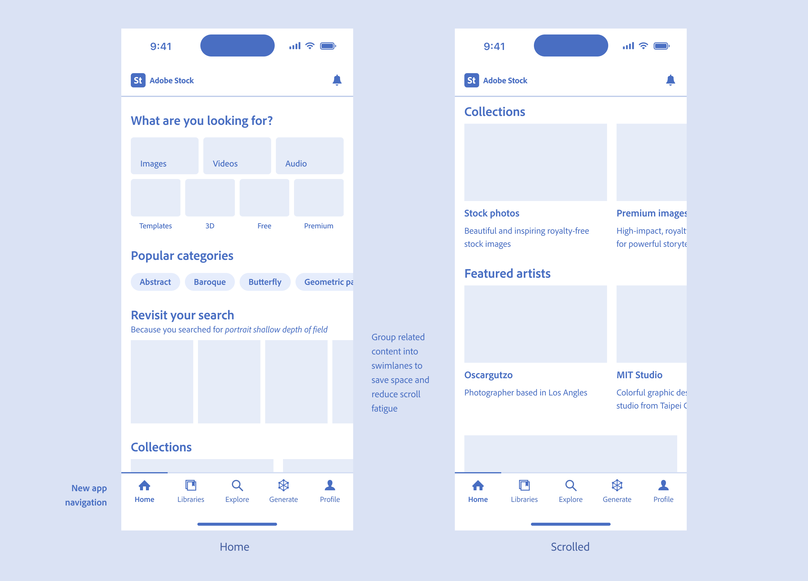
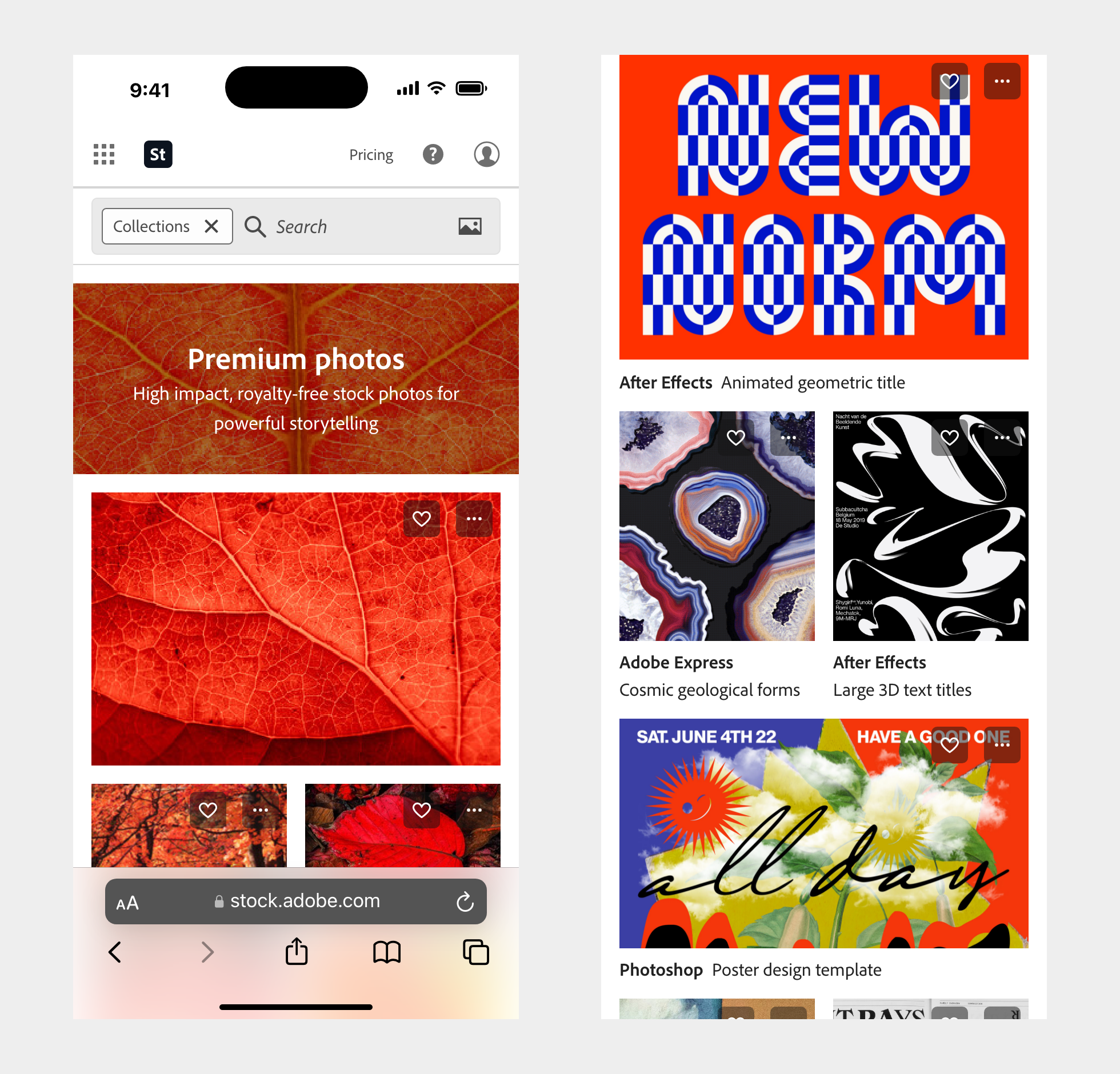
Adobe Stock existing side navigation and Collections landing page with overlays and actions on top of thumbnails
Core actions like save to library and features users found useful like batch sharing were buried or poorly implemented. Actions, badges and buttons overlayed thumbnails in the search results image grids obstructing people's ability to evaluate imagery. The site navigation was inconsistent and reorderd based on browser width. There was a lot of clean up to do, but there also wasn't a strong culture for embracing mobile, which required looking at user's behavior and existing workflows first.
Mobile site was broken and had conflicts. Core parts of people's workflow were not optimized for mobile and/or didn't work.
Research
First I created a research plan and screener with PMs and other researchers on the team. Then I scheduled and conducted 19 qualitative interviews through Usertesting.com to gather information and insights on how mobile fit into existing workflows. We wanted to better understand participant's motivations and desired outcomes, learn more about what common actions people took on mobile and if it was different than on desktop. PMs wanted to gauge people's purchase intent when using their smartphones. We screened for stock users who had licensed from Adobe Stock within the last 90 days with the cohort split in two, half with participants who had purchased stock and half with participants who had taken a meaningful action, either saved or shared an asset.
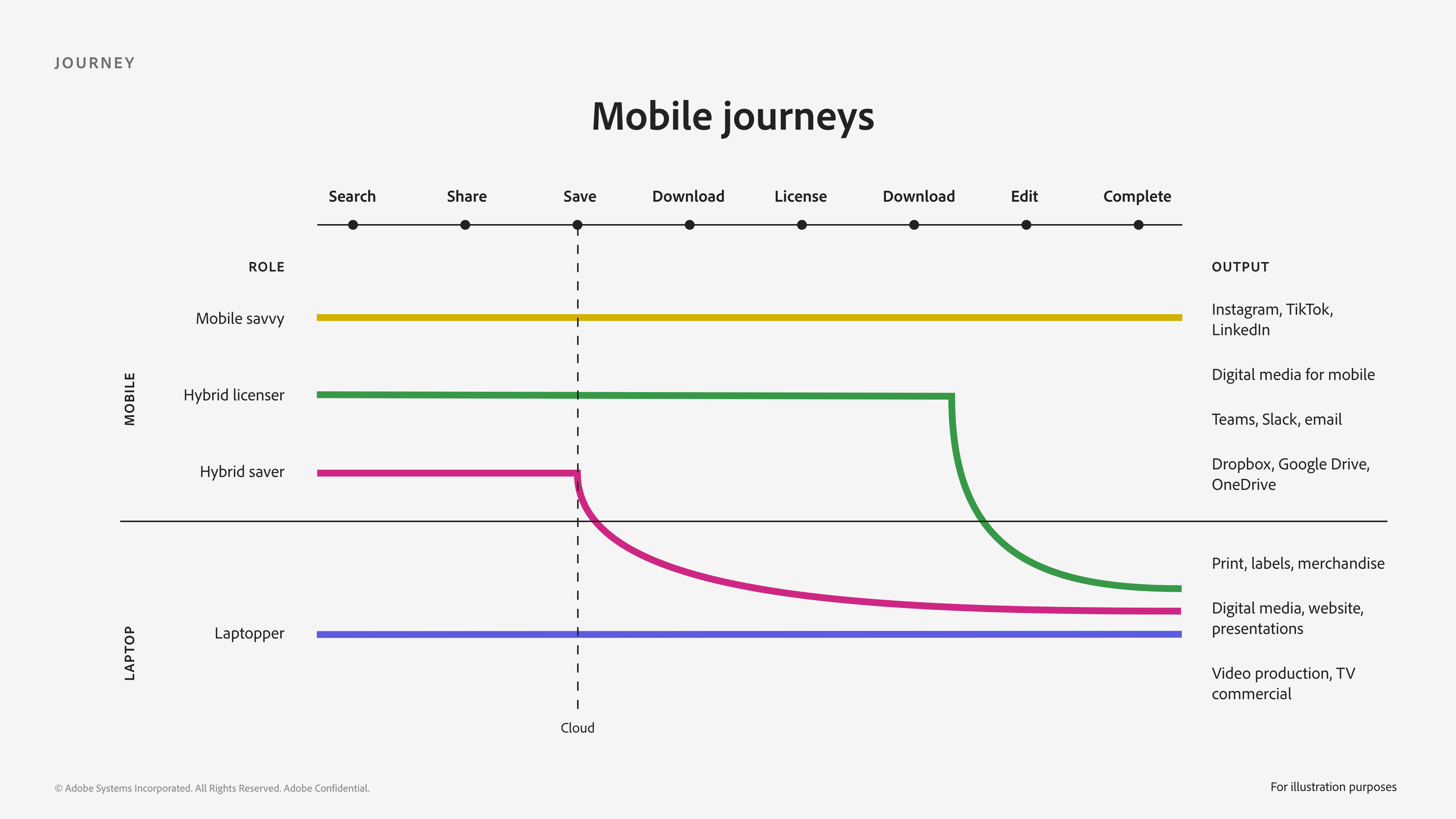
Mobile journeys based on role e.g. Mobile savvy, Hybrid licenser, Hybrid saver, Laptopper (unique visits via mobile increasing)
Previous research indicated there was low intent and less interest in using mobile to look for, share, save and eventually license stock assets. While some of the interviews indicated people had a preference for desktop centric workflows, mainly for roles whose tools or workflows require it e.g. video editors or those who preferred desktop, others had downloaded stock apps and had adopted mobile as part of their stock search. If the output was on mobile or intended for social media participant's were more likely to use mobile as a means to search for, save and purchase on mobile. They were adept at doing everything on their phone. The more familiar someone was with their project, say their personal wellness blog, and the types of imagery required they were comfortable using mobile as a means for stock procurement.
The findings also suggested most people used their mobile devices within reach of their laptop and were more likely to turn to mobile when they needed to do something quickly, or were in a 'crunch time' phase of their project. People tended to used their phone when their laptop or desktop was occuppied, say during a meeting.
After speaking with participants and observing their behavior, I had them share their screen via the Zoom mobile app, participants wanted to be able to browse stock on their phones whenever they had free time, without obstruction from overlays. They found utility in being able to batch share potential images quickly with their team, get feedback and save them to a board, collection or library for later. Some were more adept at using their phones and had dedicated native iOS stock apps installed on their phones which were stickier starting points. Others started their stock search with Google because they viewed the Google search as casting a wider net across across a variety of stock providers.
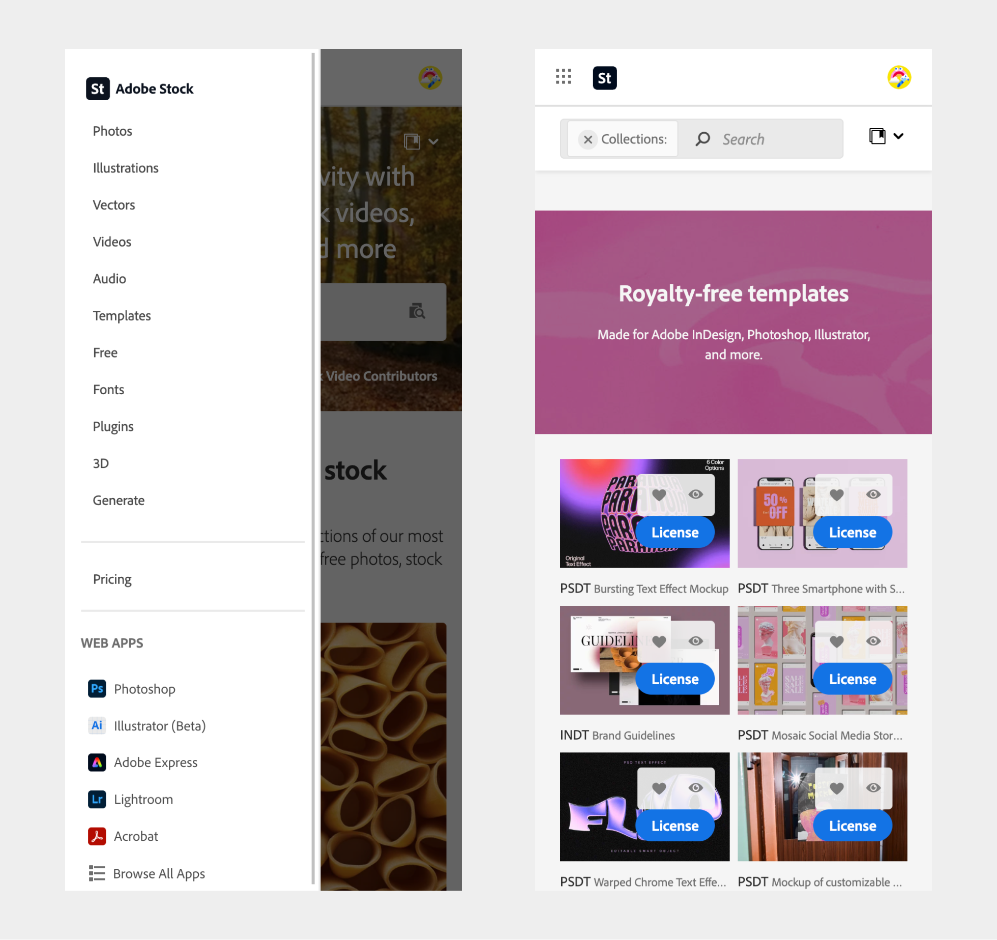
Collections color story without obstructive overlays
Still others wondered why there wasn't dedicated native app with mobile specific navigation for them to use. They expected their mobile stock experience to be like other mobile shopping experiences they encountered on their phones. Some participants were accustomed to browsing, searching for content and doing everything on their phones, even purchasing or licensing assets, especially if they were away from their computer or on location.
Given the findings I tried to illustrate the multi-device environment many participants had adopted and still acknowledged there were some roles, those working in more complex production environments like video, who still preferred to mainly use their existing desktop machines and see stock in context before making a decision to license. I also believed there was a case for prioritizing mobile based on these qualitative insights and reframe the problem space in a way which showcased how mobile could function as a starting point, collaboration space and surface for searching and saving. Based on the research it was clear to me users may transact on mobile or later on desktop, with added benefit to both users and the business once an asset is saved to a library and the cloud.
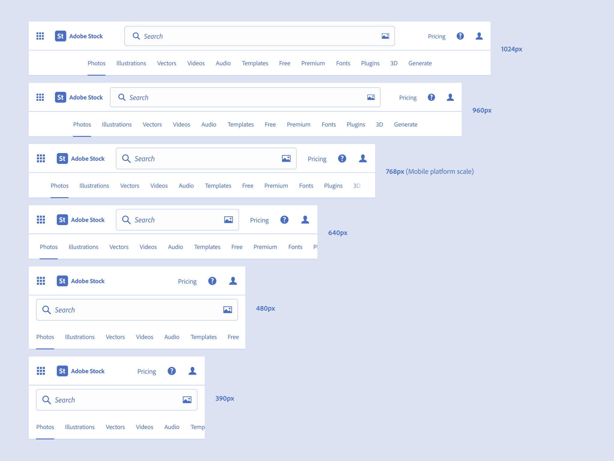
Platform scale
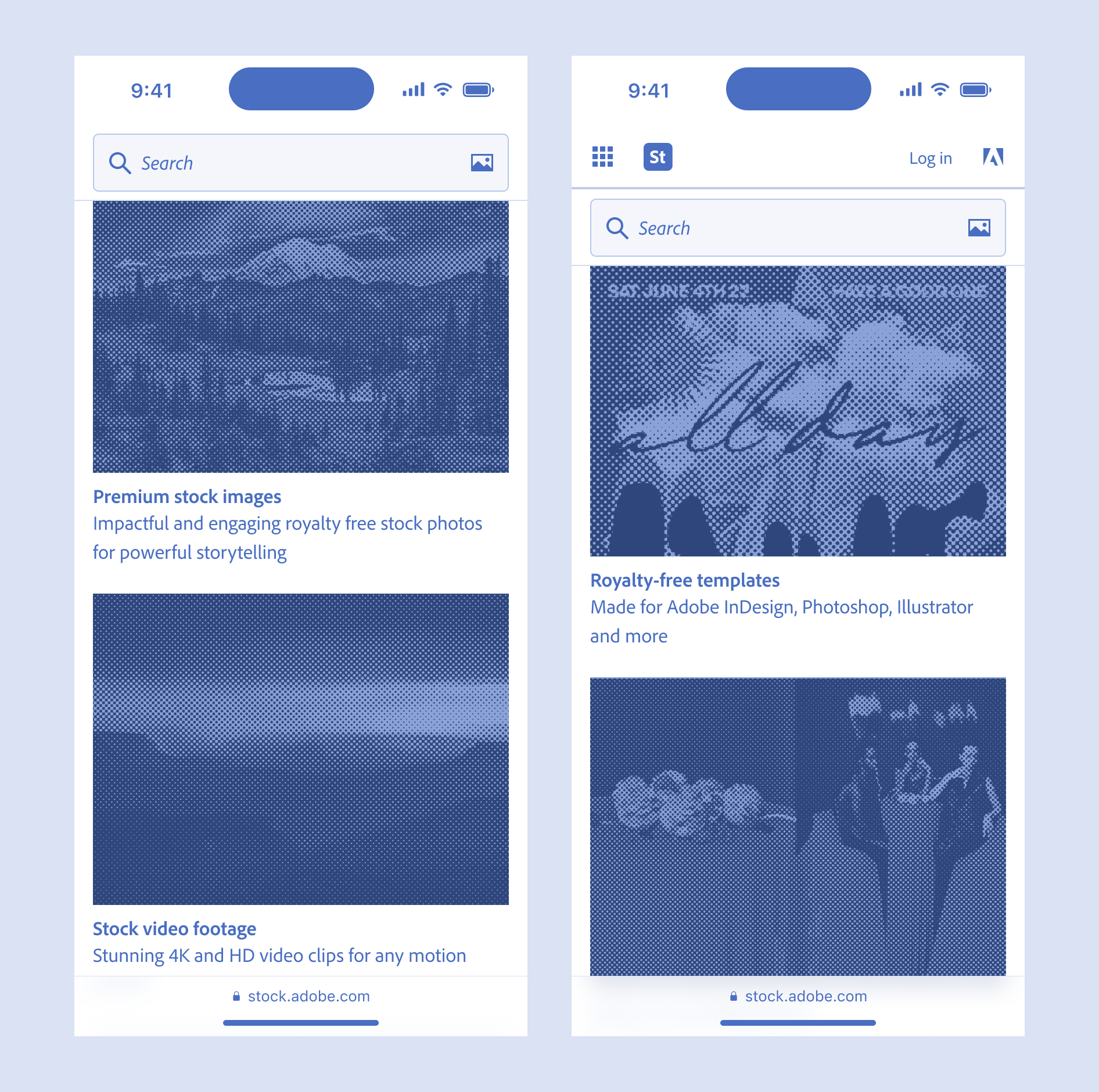
Adobe's design language Spectrum provided specific guidance for mobile and desktop platforms, with minor changes to the type and icon sizes above and below 768px. The team needed examples of the platform scale for the Adobe Stock product itself across viewport sizes and references for how to handle side panels in a responsive environment. I created reference imagery and specs to enable the team to consider mobile as a core part of their design deliverables.
Adobe's Spectrum design language gives specific guidance for type sizes, UI controls and input targets across desktop (left) and mobile (right)
Pivot to Generative AI
In April of 2023 everything was focused on generative AI. As new capabilities emerged within the industry and LLMs became ever more sophisticated, especially text-to-image (T2I) based AI generators like Stable Diffusion, Midjourney and DALL•E 2 stock providers raced to understand the impact new AI tools would have. The AI frenzy was causing quite a ruckus.
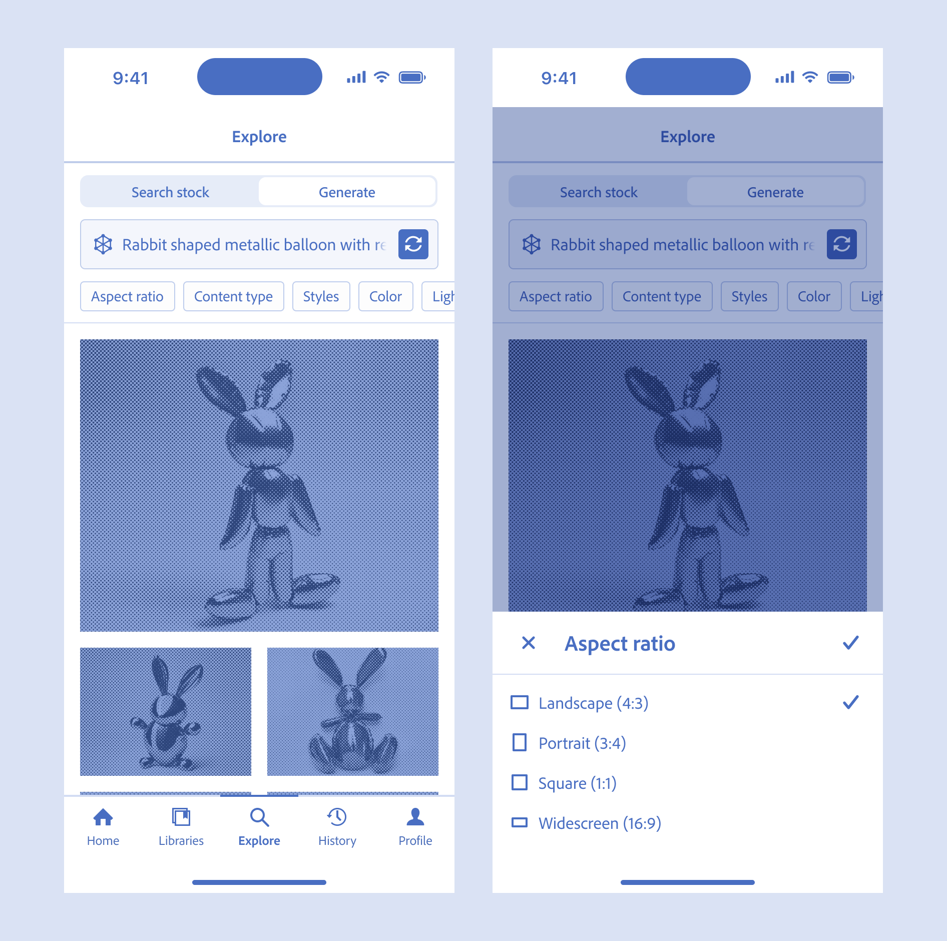
Exploration combining traditional stock search and an embedded AI generator for mobile. Art imitating life, machine imitating art. Prompt based on the work 'Rabbit' by Jeff Koons
In order to better understand how the new T2I AI tools were being adopted and its impact on stock I conducted additional research with Adobe Stock customers. There were a million questions from stakeholders. PMs wanted to know more about where participants expected to access or find an entry point into an AI generator on the Adobe Stock website, which AI tools they currently used, how many prompts people were typically doing, what edits people were making to generated images and what if anything had prevented them from using AI tools for those who hadn't fully adopted.
The research included participants who had purchased or licensed in the last 90 days and we split the recruit in half, screening for participants who were and who weren't familiar with text-to-image AI generators. Our goal was to better understand how AI tools fit into stock customers workflow and if participants had any concerns about using AI generated content in their commercial or creative projects. From the interviews I annotated each video, shared raw notes with the team as they were building, then created detailed journey maps for each participant. We printed these out and used them during the vision sprint I facilitated in the following weeks.
Foundational
I explored alternatives to existing mobile information design, navigation and created a prototype for a dedicated search mode. I'm passionate about mobile design because of its utility and ubiquity. I started by drawing for the team a base set of components independent of any design language. Building a solid foundation was going to empower others and help show the way. I mapped out the underlying column and image grids at all common breakpoints. The mobile spec work was done horizontally across all areas of the product including navigation, landing pages, search, filtering, asset detail views. It was an overhaul of the existing product experience in its entirety. The mobile guidance provided examples for future work and experiments.
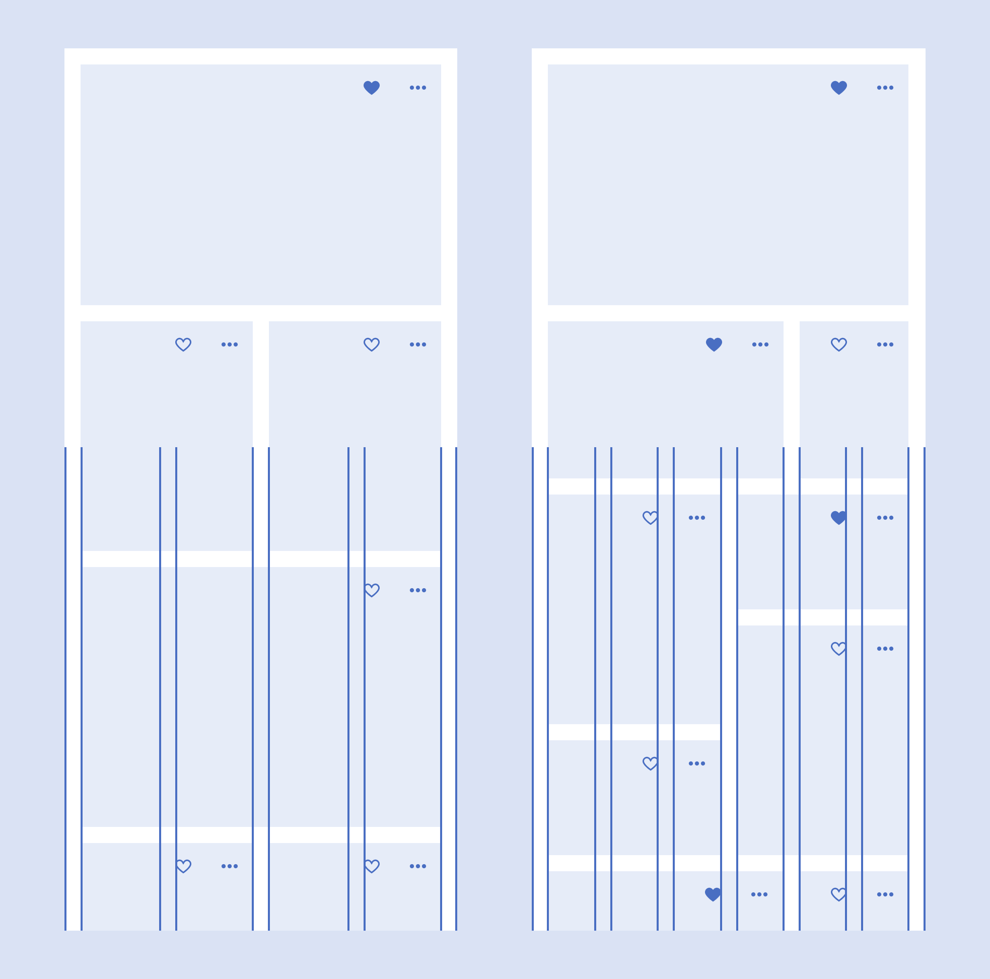
Both 4 and 6 column grids may be more useful than a 12 column grid for mobile screens
In order to create a scalable system that was adaptive for the web and explore an iOS app concept I created a base set of components and page types that used the Spectrum platform guidance for mobile token sizes which account for mobile touch targets. The wireframe style was agnostic of any particular design language. Stock wasn't adhering to the latest Spectrum component library and Adobe at large was still iterating on Spectrum 2's core design language.
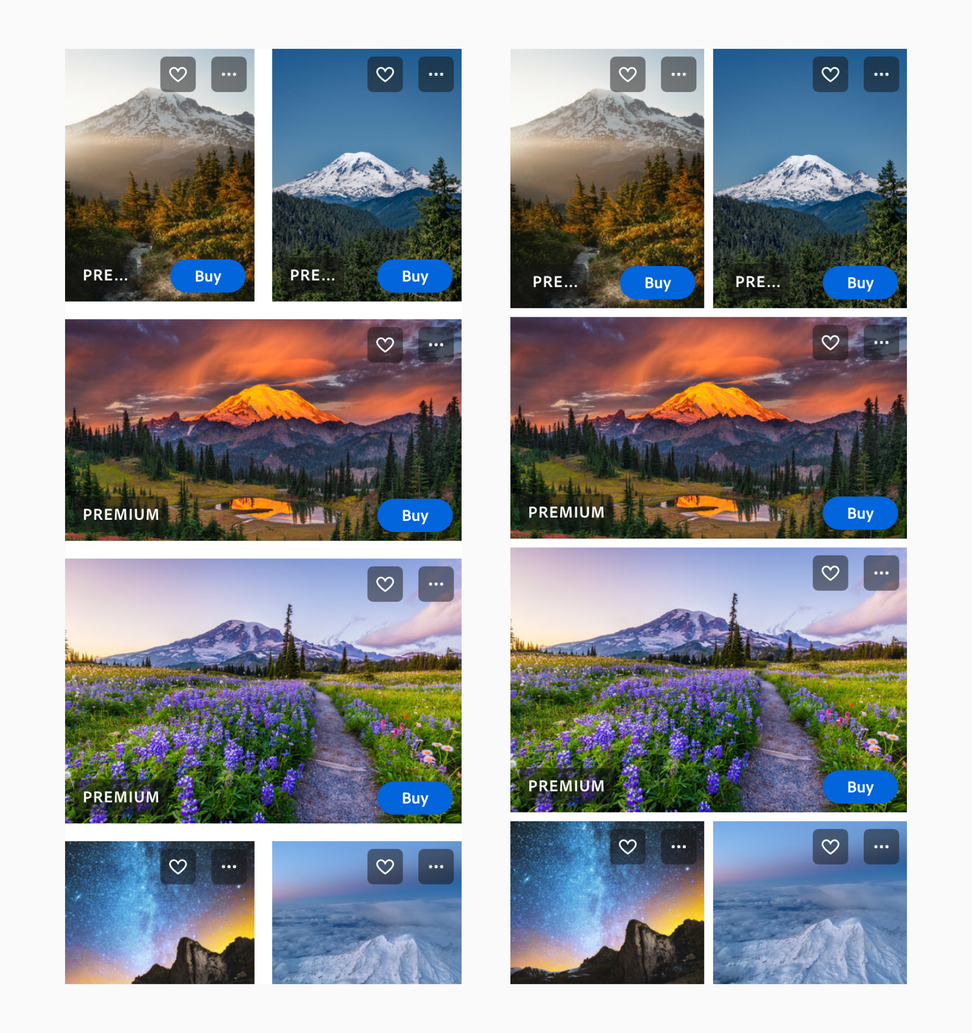
Image grid with 16px and 8px spacing. Concept suggests choosing an image grid based on amount of overlays.
Recommended mobile specific scroll behavior to make search field persist and provide access to navigation
The foundational work for mobile included the following principles: 'Consistent & predictable', 'When it breaks fix it' and 'Don't take out functionality'. I suggested guidance for creating consistent and predictable experiences across viewport sizes, navigation and feature sets. In some cases the navigation reordered depending on how wide the screen was and certain features like filtering were only available under some conditions.
Then pointed the ways to simplify their thinking around break points. When the desktop or mobile screens 'break' you fix it. Lastly 'Don't take out functionality' referred to taking out capabilies for mobile. Mobile isn't necessary less because it's a smaller screen. People equate smaller with less but mobile users appreciate the speed and convenience of mobile. Changes made to the mobile experience should improve the overall desktop experience as well.
Vision sprint
I facilitated a cross functional workshop with Engineering, Product and Design leads, introducing the team to concepts I'd learned at Google and used in the past to help solve difficult problems. The methodology and exercises were largely based on the Google Ventures format for sprinting and combine a series of sessions of individual thinking and then sharing with the larger group. We spent a week reviewing research, revisiting work in progress, drawing, mapping and sharing ideas, discussing the role of stock in the age of AI. We then proposed new directions for future work and explored new designs and shared with stakeholders for feedback.
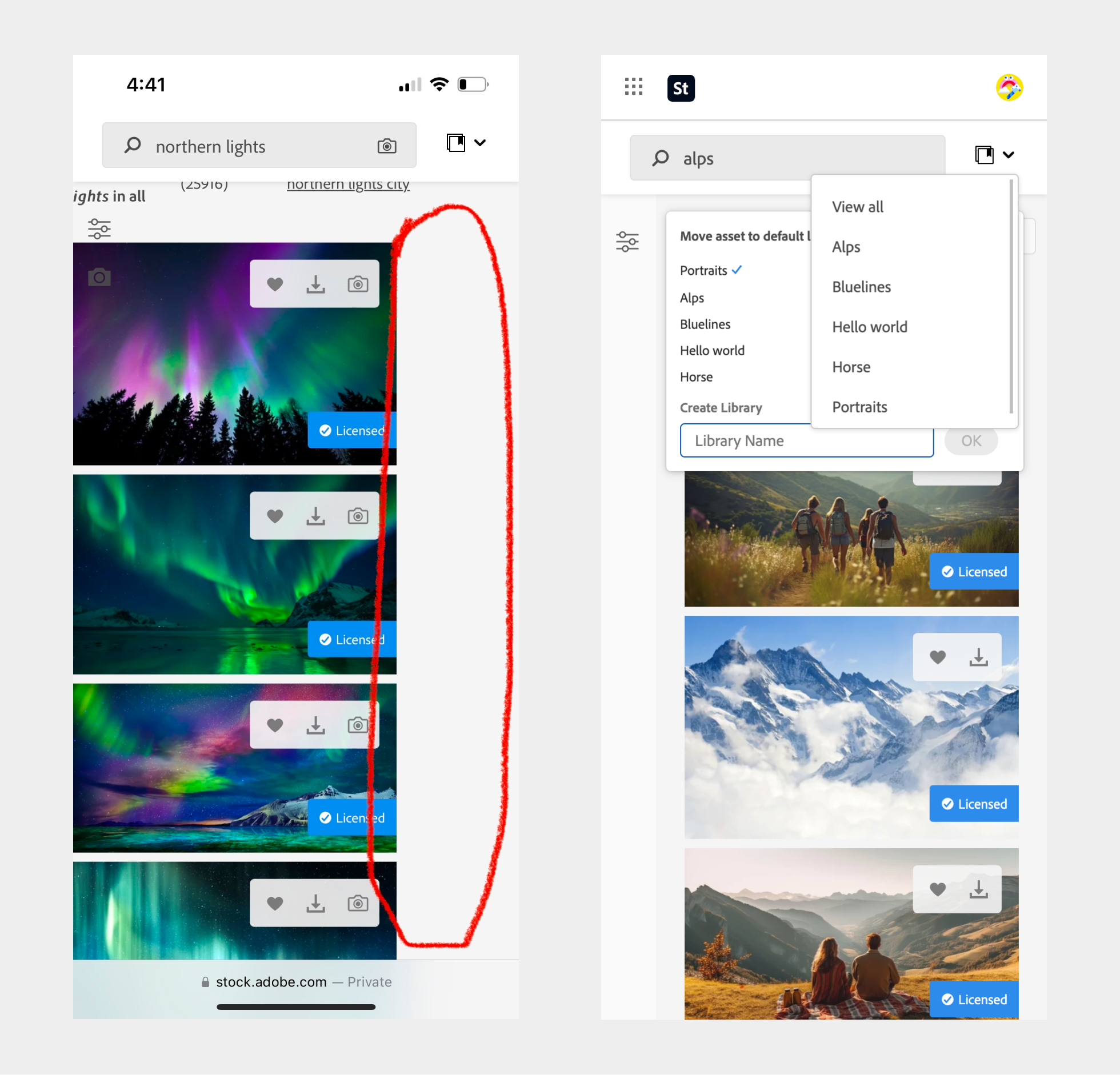
Save to library
After interviewing participants during the mobile research and observing them using the Adobe Stock mobile website and other similar stock providers mobile apps I suggested prioritizing saving to library as a primary action for mobile. Core parts of the save to library workflow were missing or had conflicts. After doing an audit of the existing mobile website and functionality I recommended making minor CSS changes to allow people to batch share with their team and license stock directly from libraries, which already mostly existed but needed optimizing.
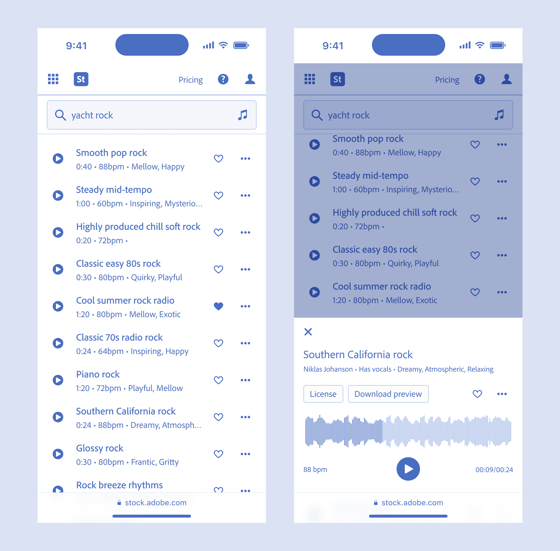
Audio case study
In most cases mobile hadn't been considered and many views simply did not scale to smaller screens and mobile devices. Audio was one example. There hadn't been a mobile approach so I organized the existing tabular design and made it fit on even the smallest phones by breaking up the information into primary and secondary actions. Users could still browse titles in the list, see the duration, beats per minute and other metadata. Tapping play would still play the audio directly from the list view, only now the wave form was revealed only when a user had shown intent. All actions were still available to the user.
My recommendations into information design and site structure were laid out and I suggested ways to simplify the user experience, provide consistent and predictable UI and reduce complexity.
I explored ways to improve search, scroll behavior, sitewide navigation and common tasks like filtering and saving an asset to a library. Mobile is a good way to stress test your system, where the constraints of a smaller screen can highlight areas with room for improvement and changes that solve for mobile can be tranferred back to the desktop experience.
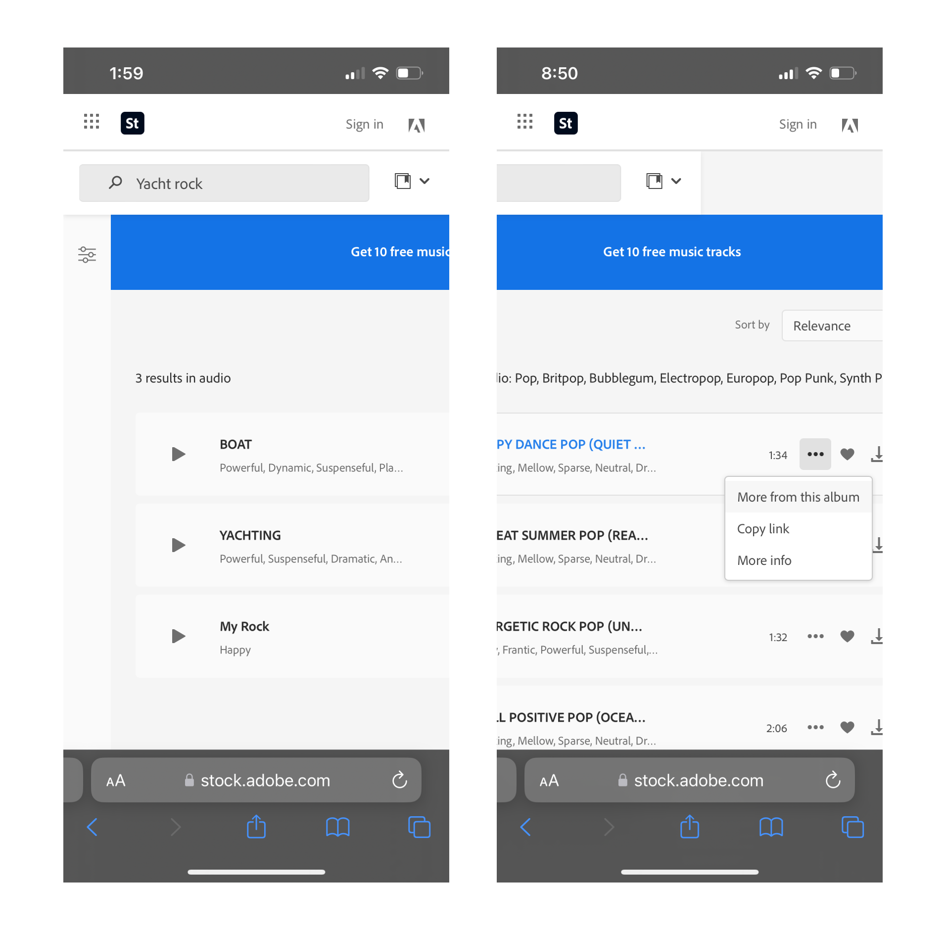
Adobe Stock Audio mobile & desktop web
Mobile constraints force you to prioritize content and actions. Breaking down experiences into parent and detail views or modals is not uncommon. Extra taps doesn't equate to less usability.
The Audio case study was an interesting exercise but ultimately had other challenges like genre and mood filtering where all the tags which get applied to a song or sound effect had been simply moved into dropdowns. An examination of the underlying data structure and how audio was categorized and cataloged was required. What's the difference between tags 'romantic' and 'sexy' for instance and why does it matter to people looking for audio?
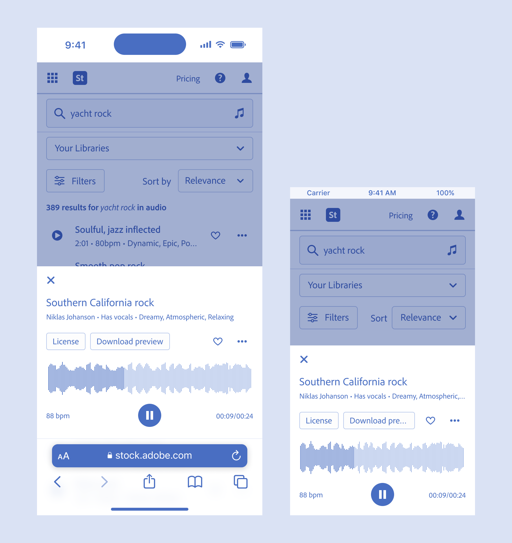
Designing for the smallest viewport 320px, iPhone SE is a good way to test the extensibility of the design (390px left, 320px right)
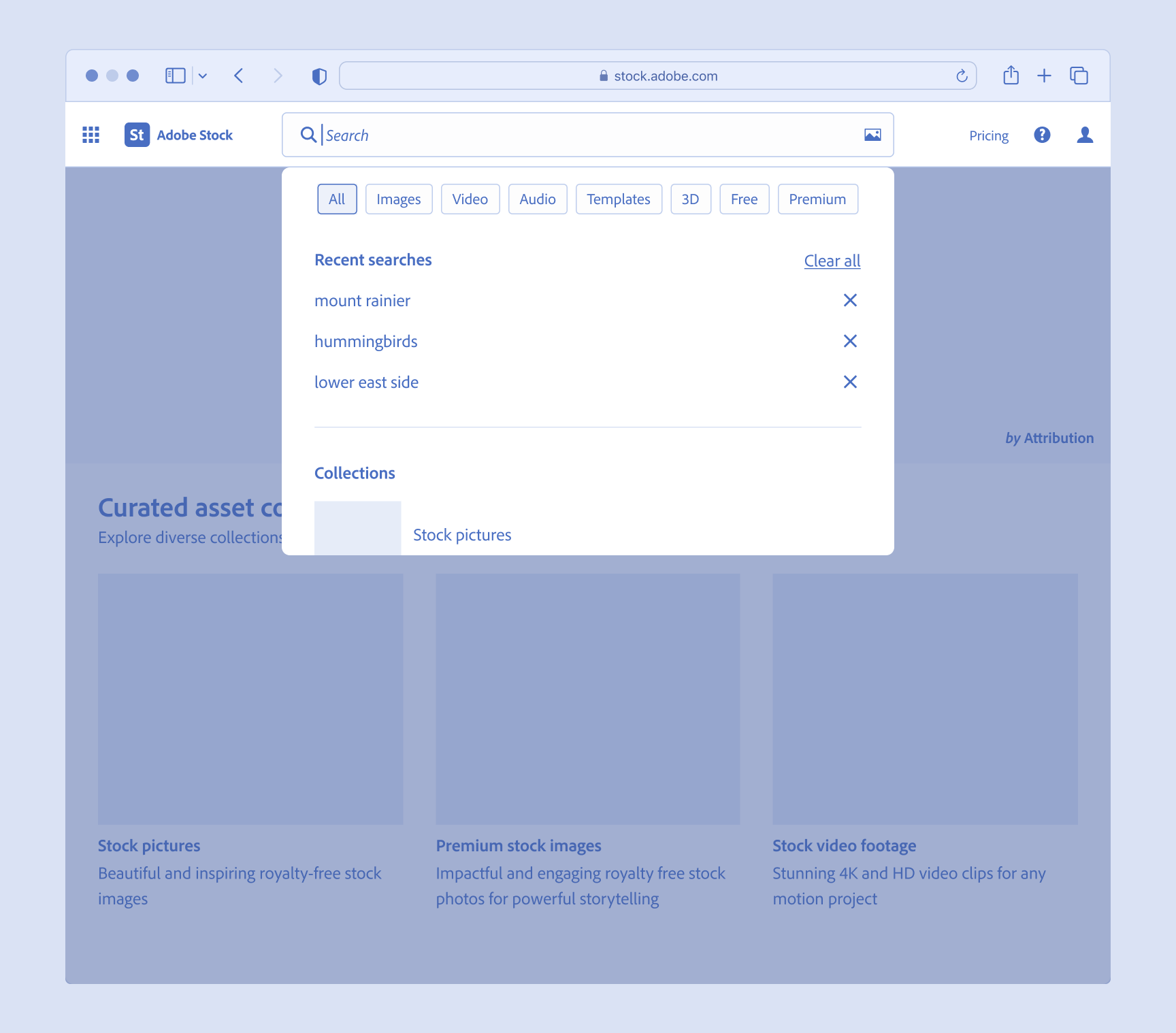
Future search & navigation
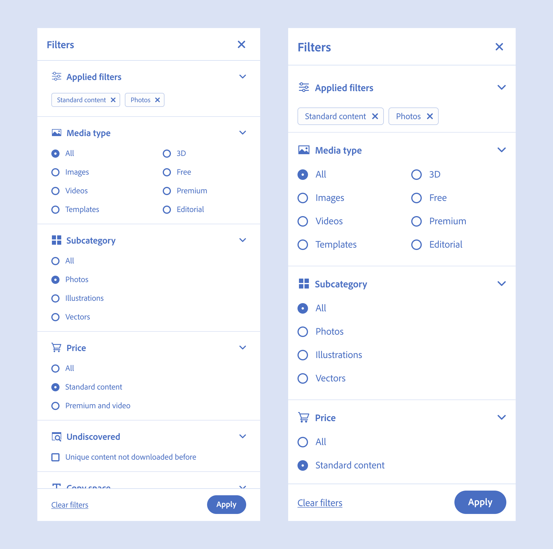
Search is core to the experience. Users come to the site with something in mind and then go directly to search. Adobe Stock hadn't solved for search refinement or asset type filtering on mobile. Users had to use the side navigation when on their phones to access either Photos, Illustrations or Audio which were largely out of sight and out of mind, buried behind the drawer. There was also limited screen real estate for asset type landing pages and capabilities as the product continued to grow. By inverting the search field, with search on top and tabs below there is more room for new content types and this design better supports a dedicated search mode even for desktop.
New navigation and proposed search at 1024px
This proposed simplification of the search experience and navigation bar allows for a more consistent way to access landing pages across screen sizes and removes the asset type dropdown when in search mode. Dropdowns aren't great because they hide content and don't work well on mobile. They are an archaic UI control.
Obvious always wins and by exposing all of the available content types rather than hiding them in the dropdown or mega menu users are better able to understand their options quickly.
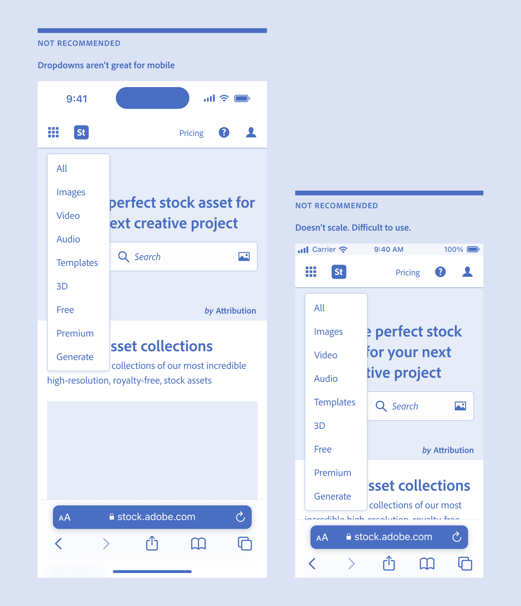
Asset type dropdown was removed on mobile. Dropdowns aren't great for mobile or desktop (390px left, 320px right).
Inverted search and navigation bar allows for dedicated search mode and more room for content type landing pages
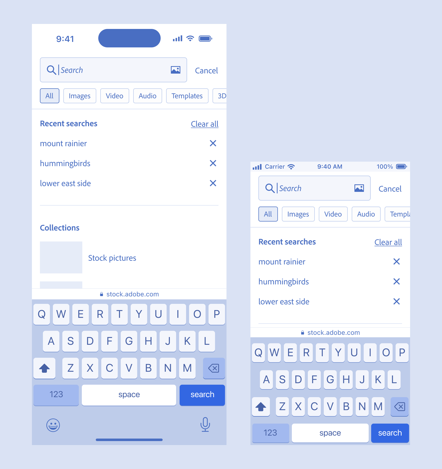
Search mode on desktop. Also works on mobile. Consistent and predictable UI across viewports. Allows asset type refinement. Replaces asset type dropdown which was removed on mobile (390px left, 320px right).
- Role
- Qualitative Research
- Interaction Design
- Workshop Facilitation
- Responsive Design
- Visual Design
- Prototyping