Starbucks
Redesigned the Pay and Manage sections on iOS, consolidating common tasks and shipped an improved account management flow for better discoverability
We redesigned the Starbucks Pay and Manage section on iOS to bring consistency and more clarity to how people managed their account and paid at the point of sale. Starbucks has a lucrative mobile payments system where users can order ahead, manage their account, check their rewards status and send gift cards. The previous version of the Manage section had mostly gesture based ways to interact with the system and some custom one off components that weren't clear for users. We made incremental improvements and consolidated all management tasks into a single modal experience to create a more predictable and discoverable experience.
Customers want frictionless account management. They also want to be able to quickly pay at the point of sale. The Pay and Manage section lets users pay and perform tasks associated with their Starbucks account. People can digitize a physical Starbucks card, transfer balances from one card to another and reload money into their account. Users can take other tertiary actions like set up Auto Reload, assign a primary card. We also gave some users the option to add a card to Passbook, now called Wallet on iOS, if they wanted.
There were several non-standard and hidden interactions within the Pay and Manage experience, for instance users had to swipe up from the bottom in order to add a new Starbucks card to their account, which wasn't obvious. Focused forms, a custom component, had been implemented as part of the first version of Pay. It didn't necessarily meet users expectations based off of how other apps worked and caused some confusion.
Redesign the Pay and Manage section for improved discoverability, limit the number of custom interactions and consolidate operations into a single modal. We evolved the product by redesigning Pay with reusable components in order to bring consistency across the Pay and Order sections, which was under construction at the same time.
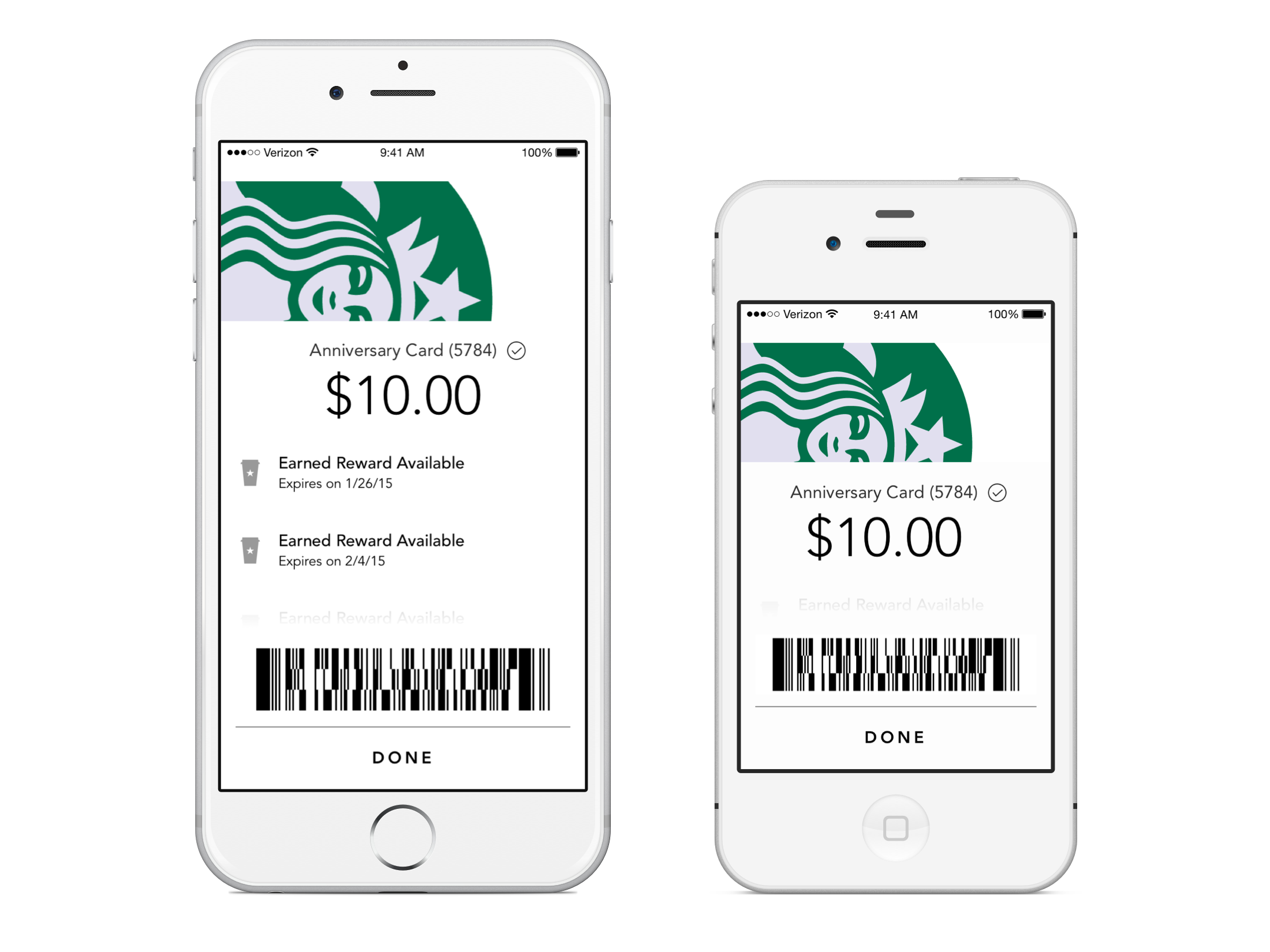
We added other improvements across the board, such as making the timestamp schema more scannable, adding helper text to explain Reload and Auto Reload and adding dollar amounts to all confirmation buttons in Transfer, Reload and Auto Reload. We changed the dollar denominations from larger increments to smaller ones e.g. $10, $15, $20, to more closely match user's spending habits. We added an alert that trigger locked destructive actions like removing a Starbucks card and added earned rewards to the barcode screen, something we brought over from the Android app, to create a better customer experience.
We took things out too, making a decision to deprecate the card flip animation when people tapped the pay button to access the barcode screen. There were other unnecessary "Are you sure you want to do this?" alerts that caused friction that were also removed.
During the redesign of the barcode screen we observed how people held their device when they paid at the POS to determine where to put the barcode, either on the top or bottom of the screen. Sometimes people would swing the device out from their wrist, other times they would present it flat and sometimes the barista would even pick up the scanner and scan their phone.

We presented this work in detail to the VP of Digital Product and the Delivery Manager and handed over comprehensive user flows to engineers that included edge cases for all major sections inside of Pay and Manage, including the barcode screen. I also created a prototype to help with implementation.
During the design process we had to make a few compromises. For example, we wanted to take advantage of third party software that would use the device's camera to automatically input the 16 digit code found on every Starbucks card in order to reduce friction during the add card process. We also designed and advocated for an animation when users transferred balances from card to card to keep them oriented. We also campaigned for a custom numeric keypad that would help build trust with users when dealing with money but ultimately those ideas didn't make it into the product.
This redesign shipped and lived on in the app for several years. The Starbucks mobile apps were helping the company become a leader in the retail space and consumer mobile tech. Over 9 million customers were paying at the point of sale with their phones, roughly 20% of all in store transactions.
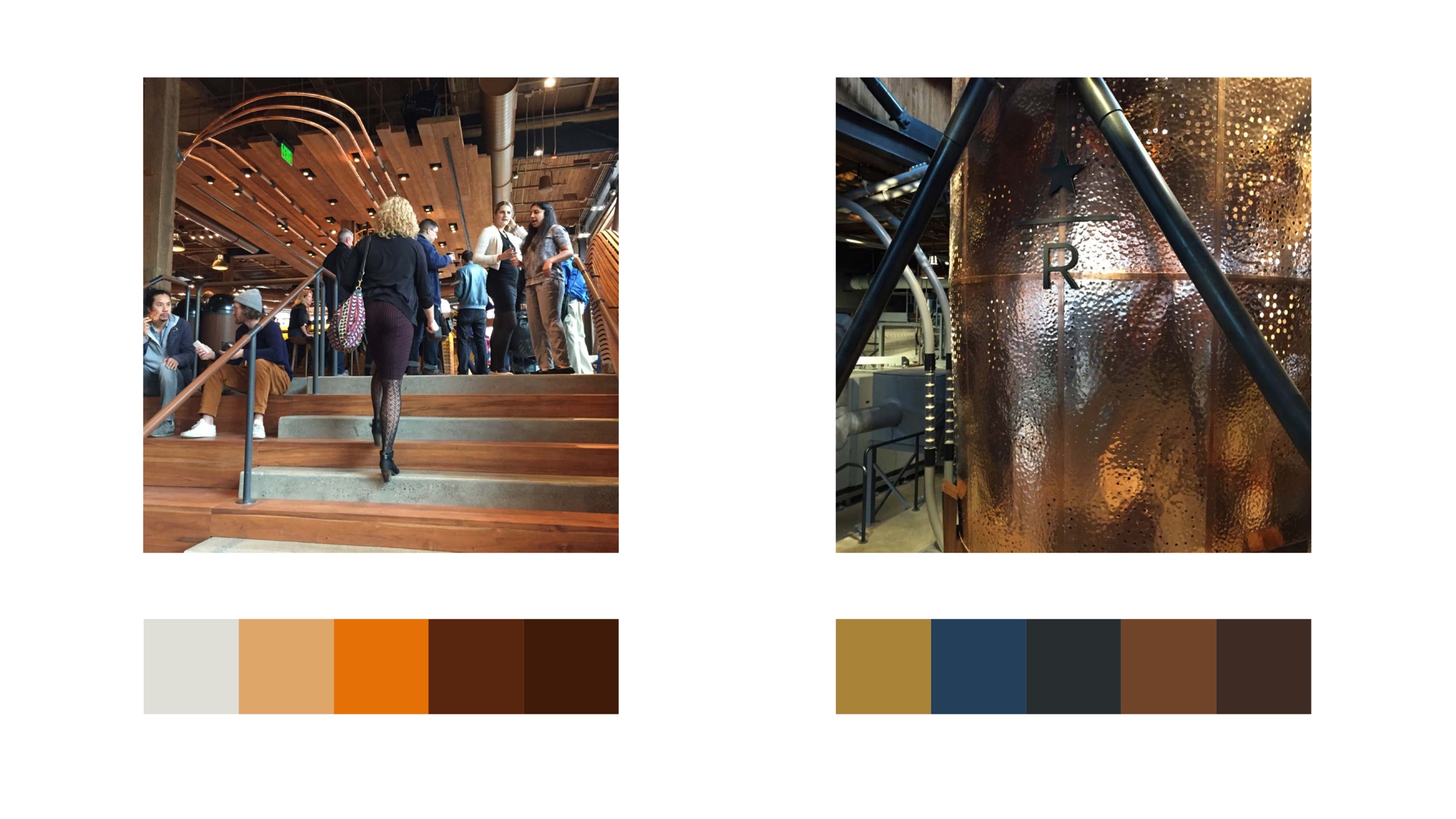
At the time we knew that there were other improvements to be made to the interface to increase contrast and legibility. The interface was originally inspired by the Reserve branding and package design. We started the conversation around how to reduce the number of greys by sampling the color schemes found in the Starbucks Roastery.