Strategic design proposal that folded in user feedback, previous sprint exercises and fresh ideas to bring clarity to the existing app. Provided a solid foundation for future work, including an opt in scrolling experience.
The design team was asked to come up with a two year vision for the product. We held a team offsite with the CEO in a Breather space in SoMa. Throughout the day we ran several Google Ventures style sprint exercises in order to cast a wide net. We merged our ideas and converged on themes that ranged from ad consolidation to cryptocurrency.
Afterwards we kept thinking about how we could improve the app. We were part of the ongoing conversations around dynamic content, editorial strategy and eventually folded in user feedback from usability tests and our own ideas about product excellence to create a proposal that we pitched to the new COO from Spotify in NYC.
Flipboard launched on the iPad in 2011 and established itself as a popular news aggregator and platform for online publishers. People use the product to get caught up on the latest news, information and stories they're passionate about, whether that's surfing or cold brew coffee or mindfulness. Flipboard drives large amounts of referral traffic for news sources like Axios, Politico, Wired, The Washington Post and The New York Times.
People can also save articles to a "magazine", a term coined internally, and share that collection of articles with others. In the early days Flipboard was a pioneer in the news aggregation space allowing people to follow streams of content across topics—a natural evolution of the RSS feed.
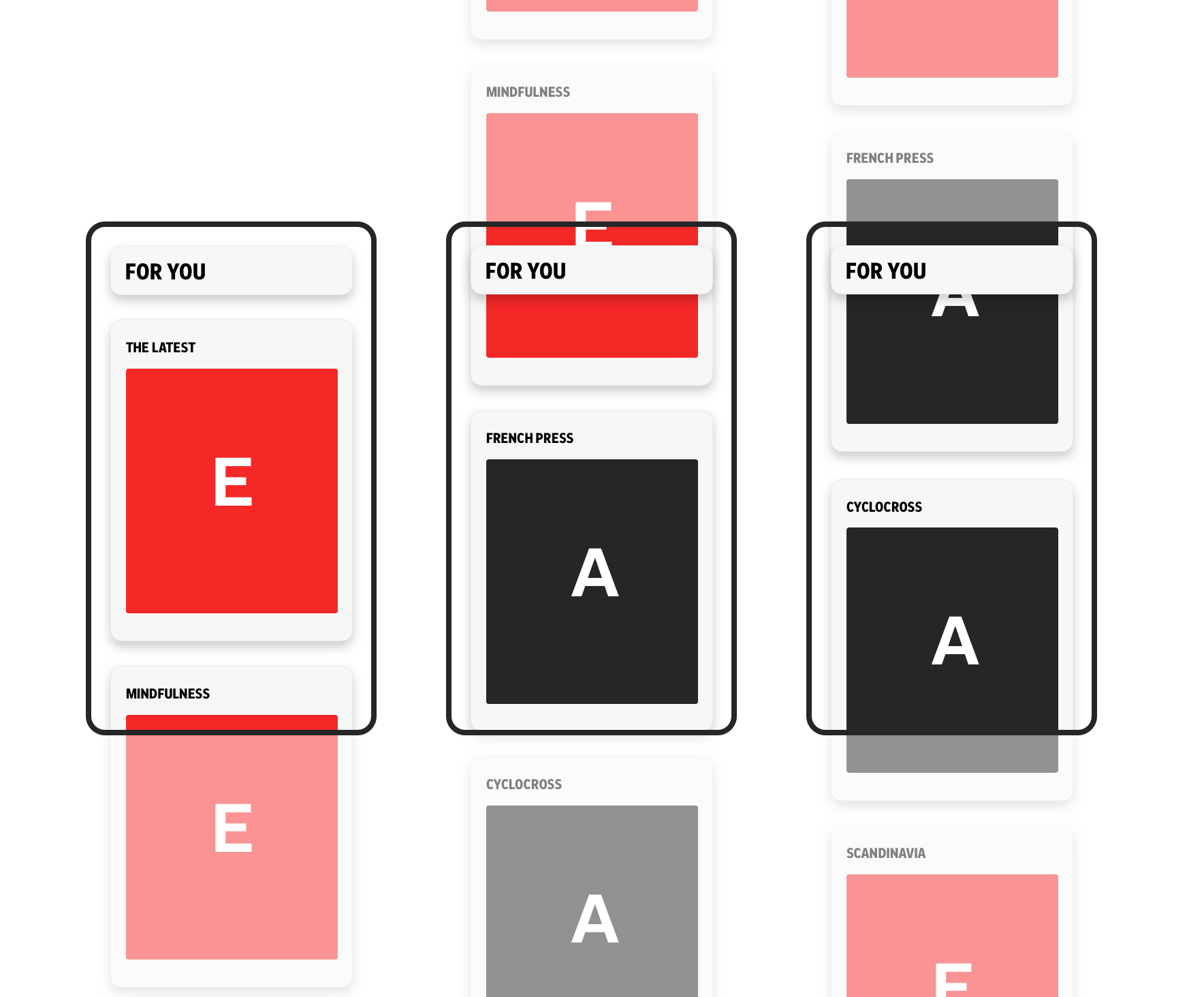
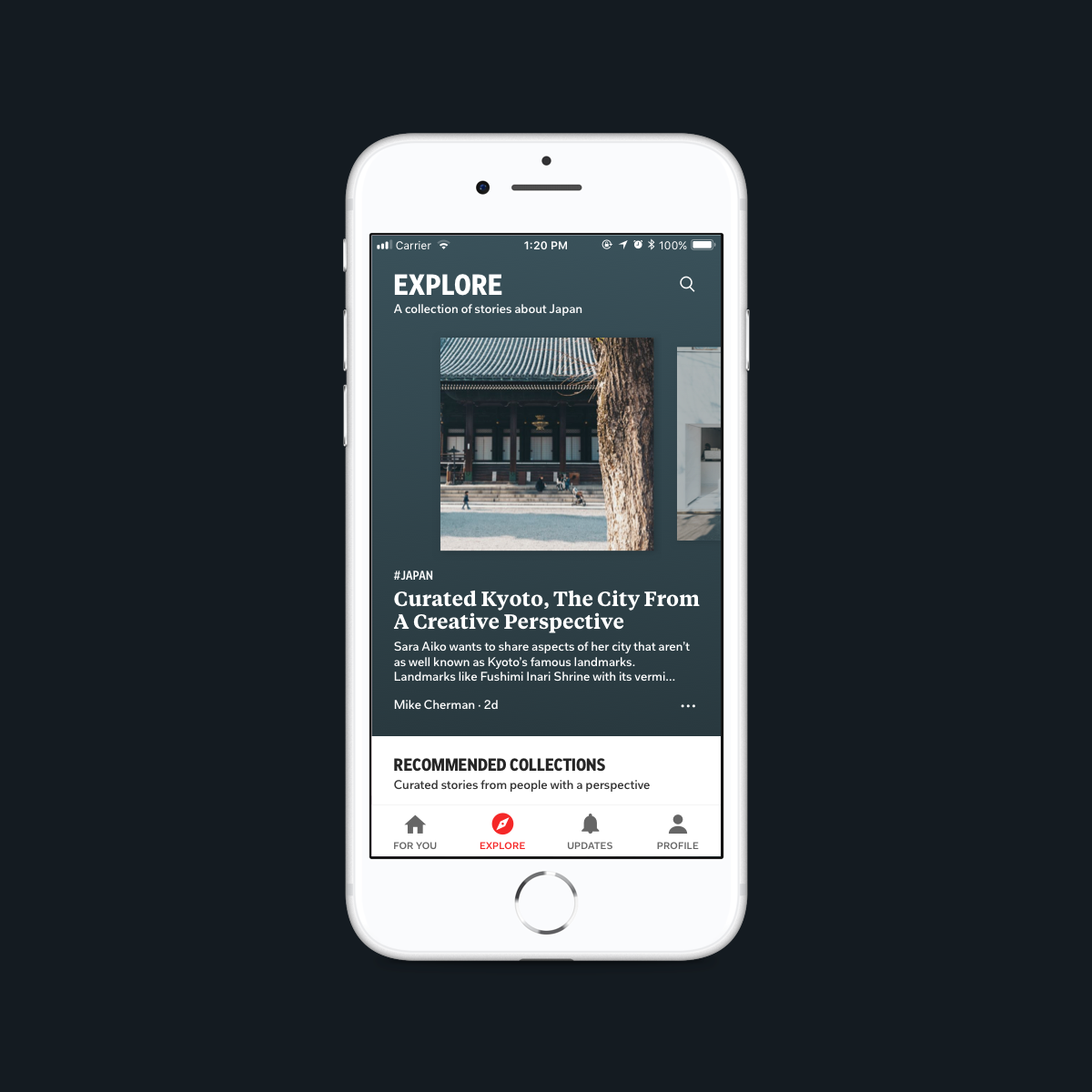
The product had made a big splash when it originally launched on the iPad. As time went on, features were added and some sections like the TOC (Table of Contents) where users saw tiles of topics they could follow, caused some confusion. People didn't understand why they were seeing content there that they hadn't explicitly followed. That section didn't have great information scent either—"followers" and "following" were in two different places, one in the TOC and the other inside of Profile. Plus the TOC was really just another form of discovery, where people could explore potential topics. In an effort to consolidate navigation and reduce complexity we came up with a proposal to fold the TOC into the Explore tab and move "followers" and "following" into Profile.
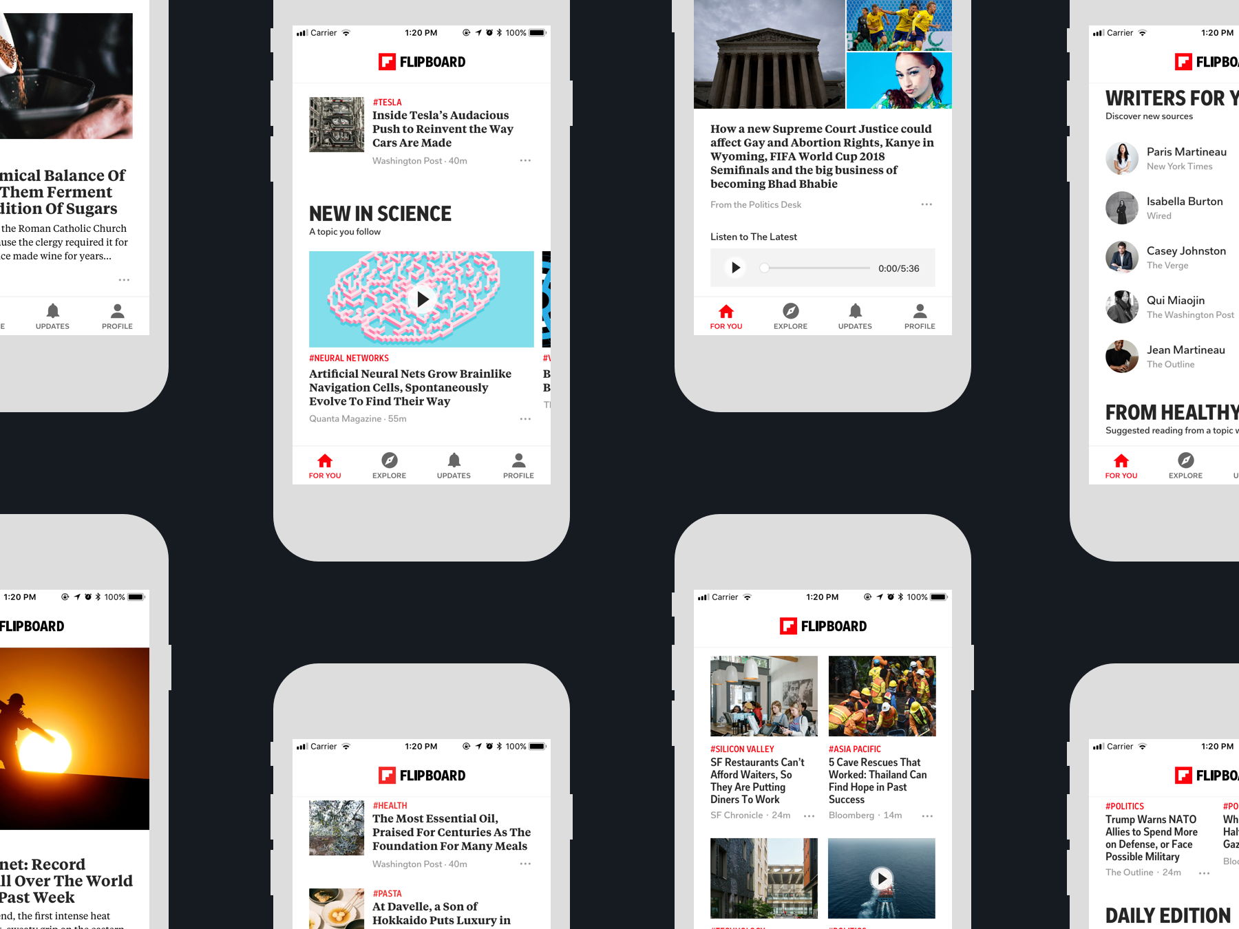
The Flipboard name and brand had been directly tied to their gestural interface. Swiping up from the bottom of the view would reveal new content in a vertically paginated experience where the bottom half of the view would be folded into the top half, similarly to how a Rolodex filing system from the 1950's worked—exception being it was digitally simulated. A plausible physical metaphor, users didn't scroll, they "flipped" from article to article. A kind of iOS trompe l'oeil that stretched the bounds of perception. This was the main way users explored new content in the feed and when the app initially launched it set Flipboard apart. It was a perfect blend of brand and digital experience. Flipboard in 2011 was a well suited alternative to the physical experience of reading editorial and newspaper content, born out of the era of digital simulations of the material world.
Unfortunately the flipping experience was also detrimental to ad KPIs advertisers expect and paid for on the platform. Advertisers measure viewability rates, durations that determine when ads are fully displayed and "viewable" on screen. These durations are incredibly short, somewhere around three seconds. The flipping UI rendered display ads in much smaller durations, less than one second even as people whizzed through random articles, looking for something they found interesting.
Scrolling wasn't only better for the business it was also a better user experience. Jakob's Law indicates that users prefer your product or website to work in a similar way to other products they use. In some usability tests users weren't accustomed to the basic premise of how the app worked. The flipping experience gave no indication of how much content was consumable. The main feed of the app was a veritable never ending soup bowl with no indication of a stopping point or portion size. It also showed a multitude of disparate topics back to back with no real logical grouping or content strategy. Users would swipe up through a series of articles about science, celebrities, wind surfing or politics.
Themes that we extracted from the sprint included premium content, marketplace, product excellence, new layouts, ad consolidation, account security, respecting user attention and crypto currency. We explored many options for where we could take the product.
After the offsite we continued to think about how we could bring clarity to the product, reduce complexity and lay a solid foundation for future work through collaborative whiteboarding and paired drawing sessions. We realized that coming up with a two year road map for the product posed numerous challenges. Rather than try to predict the future we focused on how we might lay a solid foundation for future work, whether that was a dedicated video section or something more community focused.
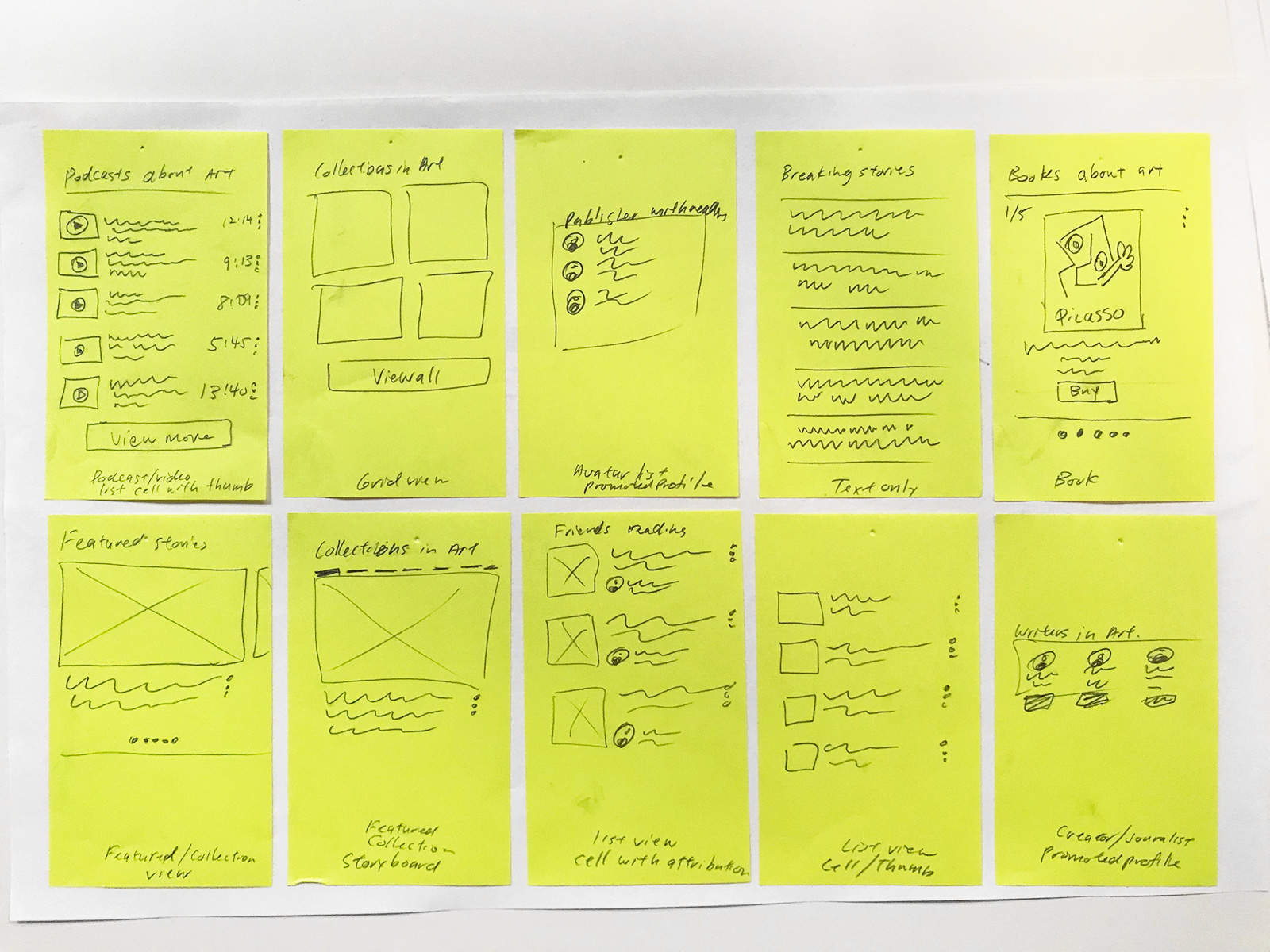
We consolidated feedback from recent usability tests and conversations with stakeholders and used the Jobs To Be Done framework to arrive at the four main sections for the app—then assigned principles to each one of those pillars. The product team folded in ongoing work from the editorial team and their dynamic content matrix and data from users. Most people spent their time in the main feed and rarely swiped over into the topic feeds. We had conversations around a dynamic home experience that showed users different content throughout the day and day of the week based on their reading habits, either from editors or algorithms.
After a few weeks, we presented our work in New York. There were certain business KPIs that this redesign addressed. Looking back we spent more time making a polished presentation deck rather than getting feedback on a prototype. Overall the visualizations around dynamic home, a more structured feed and this new scrolling direction received positive feedback from the group but it was too early to implement.
To some, this was a drastic shift from what had come before. There were years of technical and design debt that needed remedying. In the end, it was the start of the conversation for how to evolve the product and move the ball forward. There were also renewed conversations around groups and how community fit into this new vision for the product.
Years later Flipboard rolled out an opt-in scrolling experience.